Brief: Sole designer in a cross-functional pod, working closely with a PM and user researcher to redesign the transaction experience for a key C2C feature.
The feature faced high dispute rates that put our Stripe contract at risk and capped rollout at 25% of users. We set out to uncover friction points in the payment experience and deliver fixes that would enable a broader launch.
The feature faced high dispute rates that put our Stripe contract at risk and capped rollout at 25% of users. We set out to uncover friction points in the payment experience and deliver fixes that would enable a broader launch.
Problems
Contract at Risk: Dispute rates hit 0.69%, nearing Stripe’s 0.75% threshold. Crossing it could terminate our payment processing agreement, putting a key strategic initiative at risk.
Rollout Blocked: The high dispute rate forced us to cap product rollout to just 25% of users, limiting growth and impact.
Goals
1. Identify root causes of the high dispute rate throughout the user journey.
2. Address dispute triggers to enable full rollout beyond the current 25% user cap, expanding reach and revenue.
User Research
To identify friction points and improve user experience, the researcher and I conducted an iterative design cycle focused on simplifying the interface. We crafted and analyzed the ALPHA and BRAVO flows for new and existing users. Each flow offered a unique user journey, from selecting offers to completing payments, tailored to user familiarity.


We also reviewed the Add Card and Card Added flows to understand how the timing and context of adding payment information impacted user motivation and retention.
Through this testing, we identified specific pain points where users experienced friction or confusion, particularly in the BRAVO flow for new users. These insights informed our design decisions, guiding us on how and where to minimize friction and optimize the overall user journey.
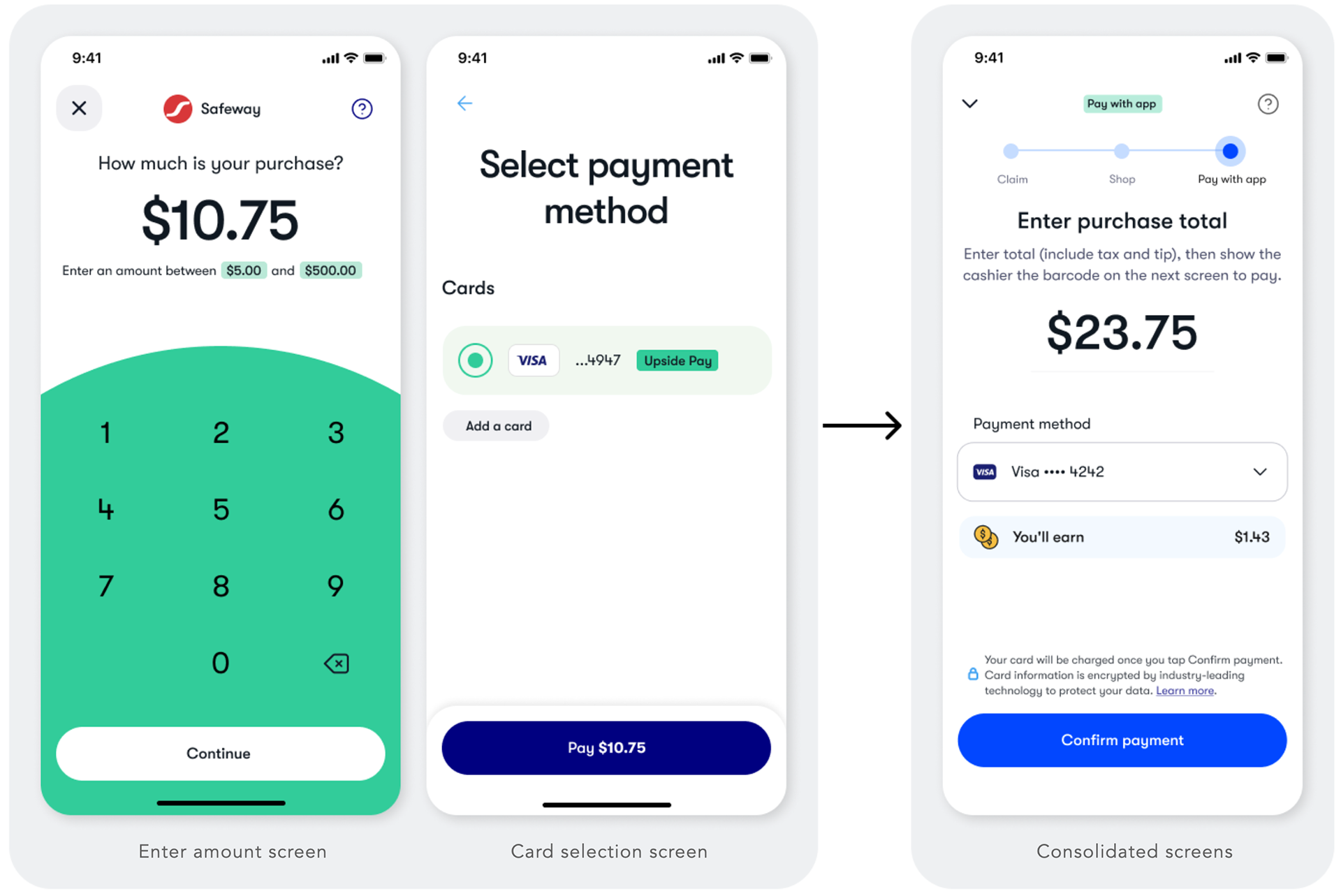
Merging of key screens
Through testing our previous flow, we discovered that many users misinterpreted the first screen as asking for the amount they had already paid, assuming the next screen was only for card selection rather than in-app payment. This misunderstanding was a major factor contributing to duplicate charges and higher dispute rates.
To address this, I designed a consolidated screen that combined both the amount entry and payment selection steps into a single, streamlined experience. I also asked the development team to add a dynamic display of the user’s earnings on each purchase, making rewards immediately visible and reinforcing overall product value.
Full-screen takeover with a chevron for the win
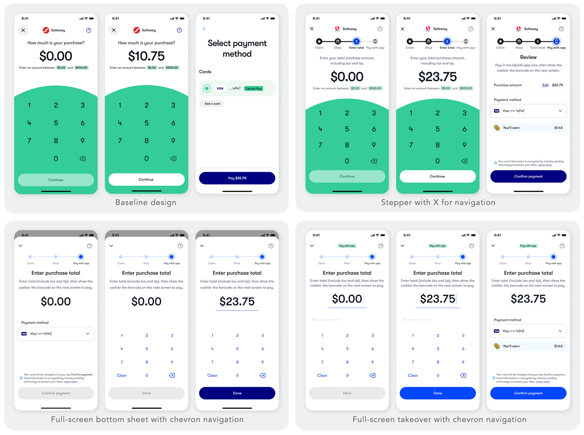
Interface Exploration for Payment Flow
To improve the user experience within the payment flow, we explored several design variations, focusing on usability and navigation. Three main designs were tested:
Baseline Design: A straightforward, minimal interface that emphasizes simplicity. Users input the purchase amount directly and then select a payment method in the next screen.
Stepper with X for Navigation: This design introduces a stepper at the top, guiding users through each stage of the transaction. The “X” icon provides a quick way to exit, offering users more control and flexibility during the payment flow.
Full-Screen Bottom Sheet with Chevron Navigation: A full-screen bottom sheet uses chevron navigation to guide users step by step through the payment flow. It keeps the previous screen visible, making the steps feel like a lightweight side action rather than a full context switch.
Full-Screen Takeover with Chevron Navigation: Similar to the bottom sheet, this variation uses a full-screen takeover, guiding users step by step with chevron navigation.
Historic data showed that over 90% of new users and 20% of existing users claimed offers without being at the location, and based on user research a chevron gave them confidence that their progress would be saved even if they exited the flow. Based on these findings, I chose a full-screen takeover to create a more immersive experience.

Branded barcode rendering
To enhance the barcode’s distinctiveness and branding, we applied style changes by integrating brand logos into the card area and using brand colors for the background. We also included key information within the object, such as the offer’s expiration time.
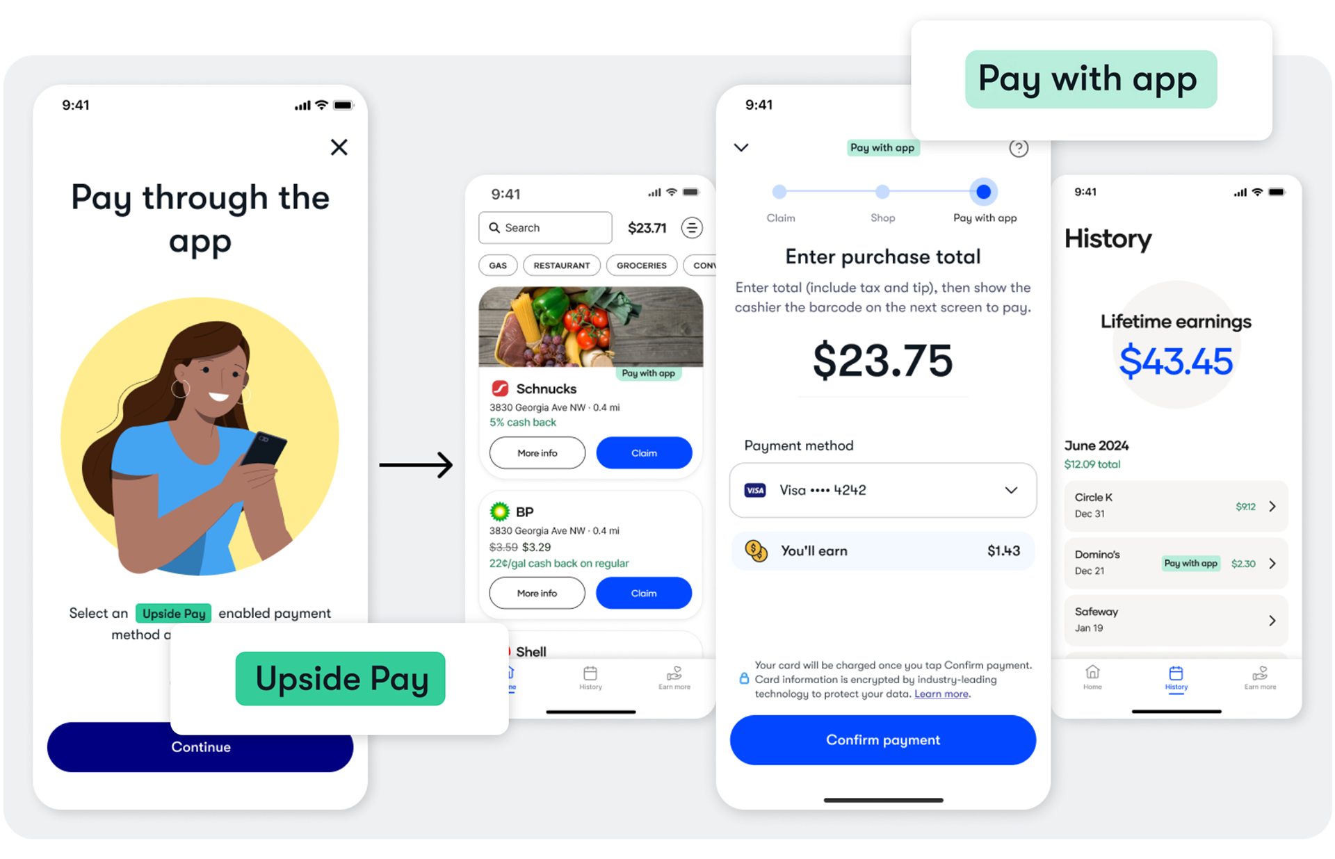
Label update
For clarity, we renamed the previous "Upside Pay" label to "Pay with app" and changed its color to improve contrast.
To highlight the distinct experience, this label appeared throughout the app in other areas like the Home screen and transaction history.
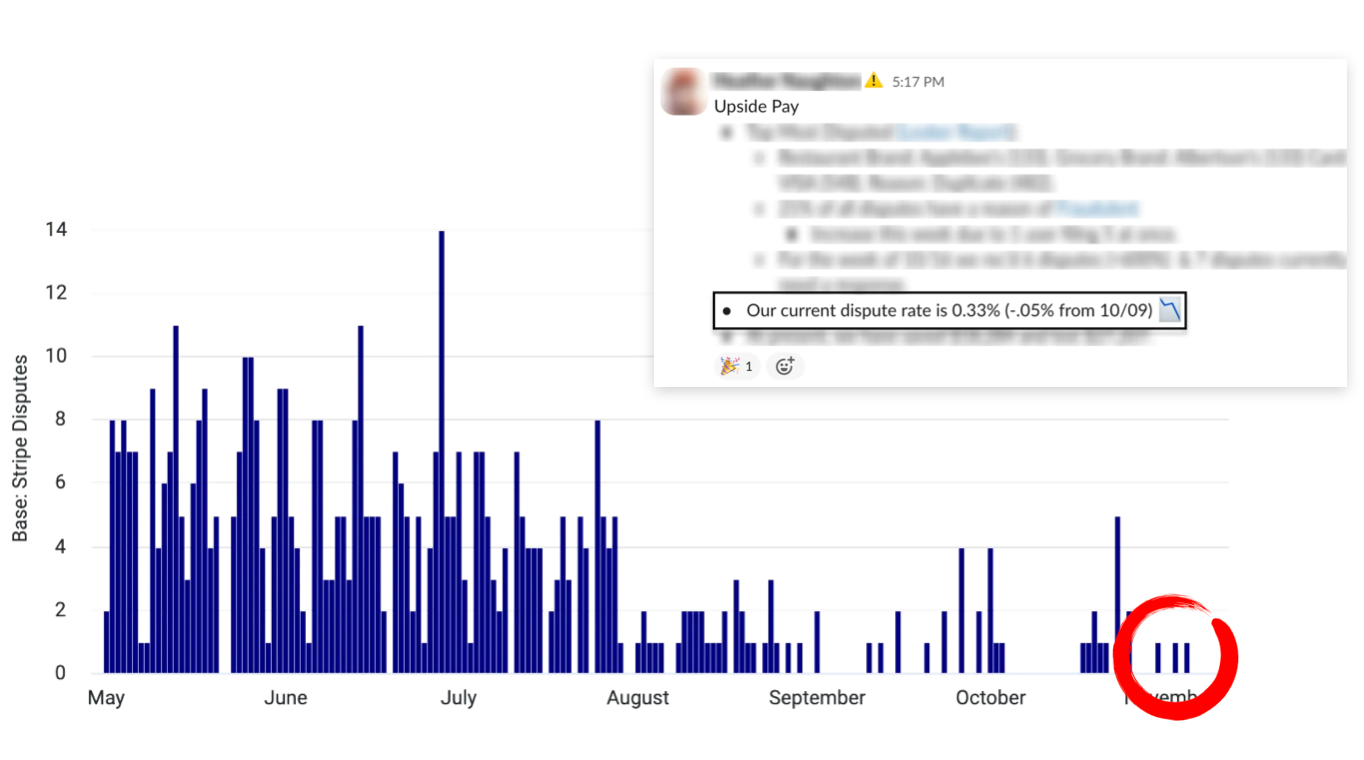
Dispute Rates
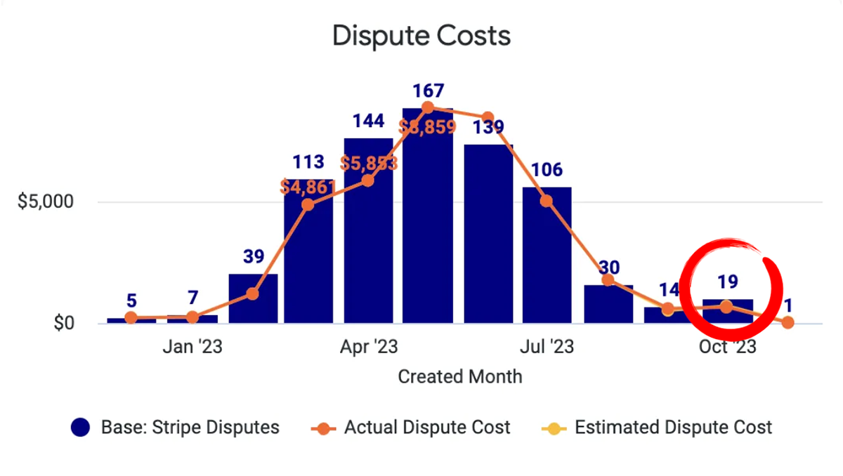
Dispute Costs
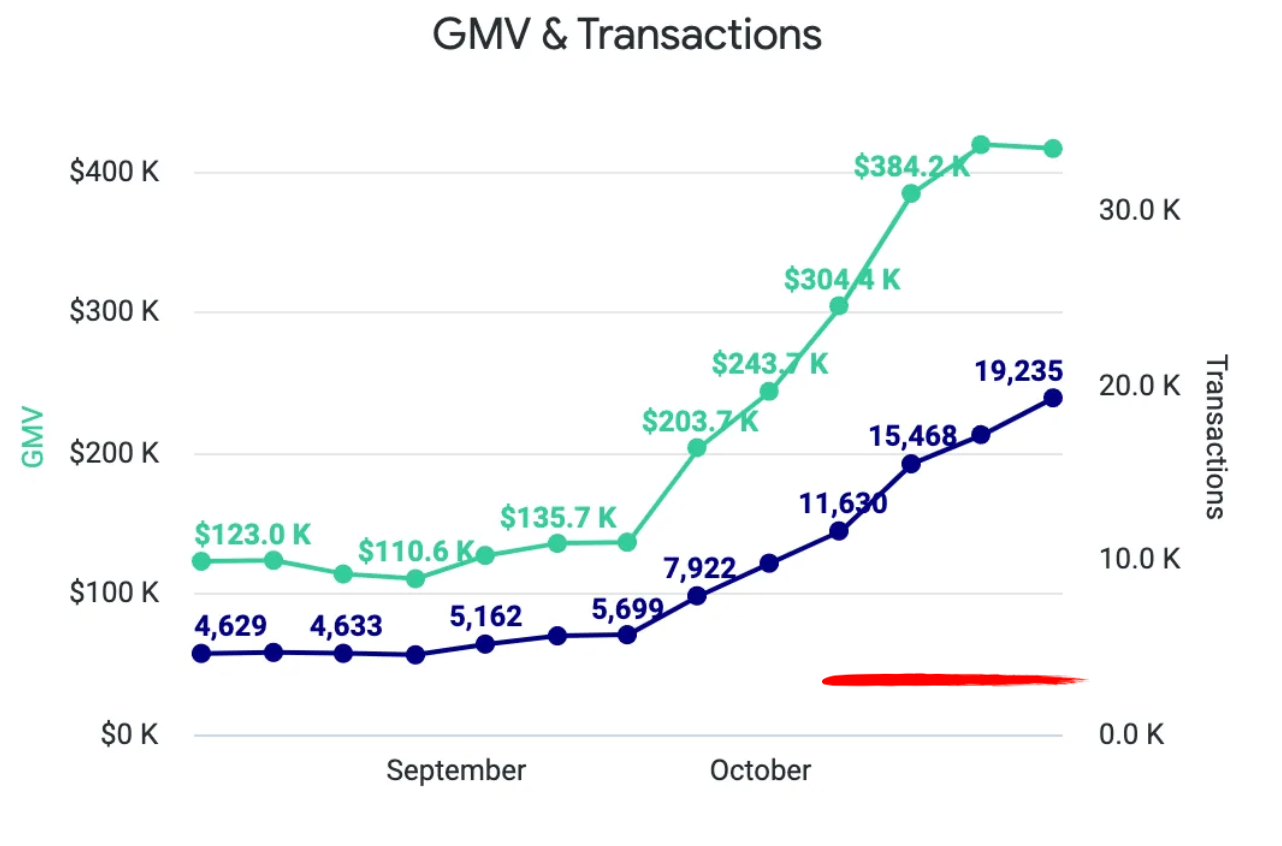
Transaction Volume
Results
• 50% reduction in dispute rates: Dispute rates went from 0.69% to 0.33%, and kept the margin since.
• 92% reduction of dispute costs: Dispute costs went from an all-time high in May of $8,800 to $700 per month.
• 251% surge in transaction volume: With the reduction of disputes, we were able to roll out “Pay with app” from 25% to 100% of our user base, resulting in a 251% surge in transaction volume.