Brief: Sole UX/UI designer collaborating with the CEO and two engineers at a real estate startup to revamp the lead generation experience. The focus was on improving clarity and usability in the application flow to make the process more efficient and attract qualified leads, all within the constraints of a small team and limited resources.
Problem
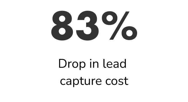
Thousands of dollars were spent monthly on marketing for lead generation. Each lead had a cost of $65, with an average of only 40 leads converted per month.
Goal
1. Increase conversion rate by 100% in 3 months
2. Improve user experience, especially on mobile
3. Cut down marketing expenses by 30%
4. Improve customer service
Lo-fi wireframes
To show my vision for the redesign of the content to the rest of the team, I created some basic low-fi sketches with content structure and page layouts.
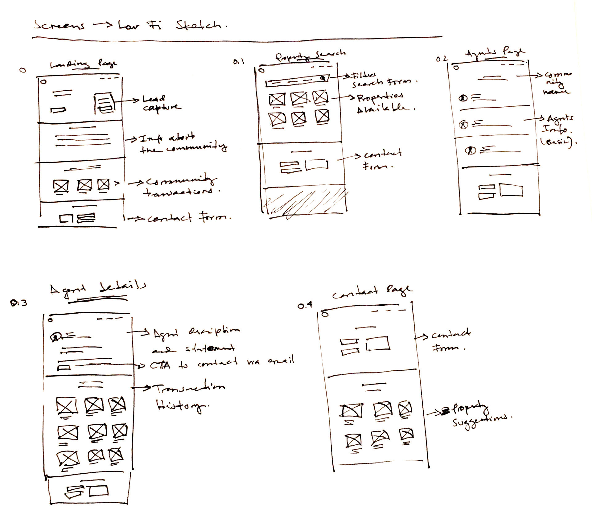
While going over the proposed layout we talked about incorporating a sign-up form on each page. We worked under the assumption that this could help us with our lead capture. During the implementation process, we tested the two versions (with and without the sign-up form) and decided to keep the form given that it was indeed increasing our lead capture.
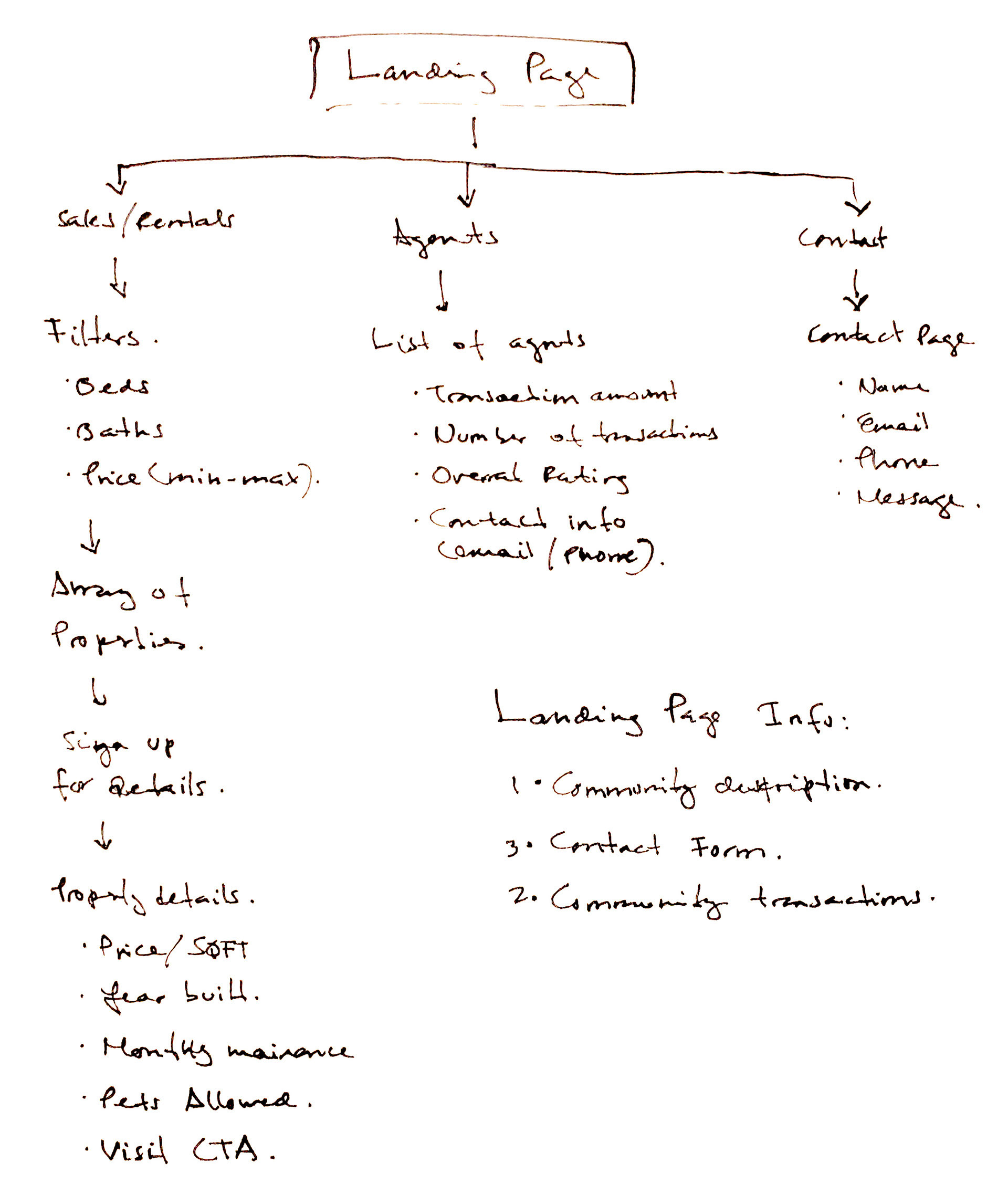
Wireframes
Taking into consideration the content and structure found in the previous design, I created wireframes to propose how the information could be displayed in the redesign.

Overview
Website Revamp: The website needed to be updated to fit the needs of potential clients. The revamp not only focused on better visuals, but also on enabling direct communication with the user as fast as possible.
Email Marketing: Email is one of the highest converting channels throughout the real estate industry, so email captures and marketing campaigns were implemented to convert more subscribers to customers and increase returns.
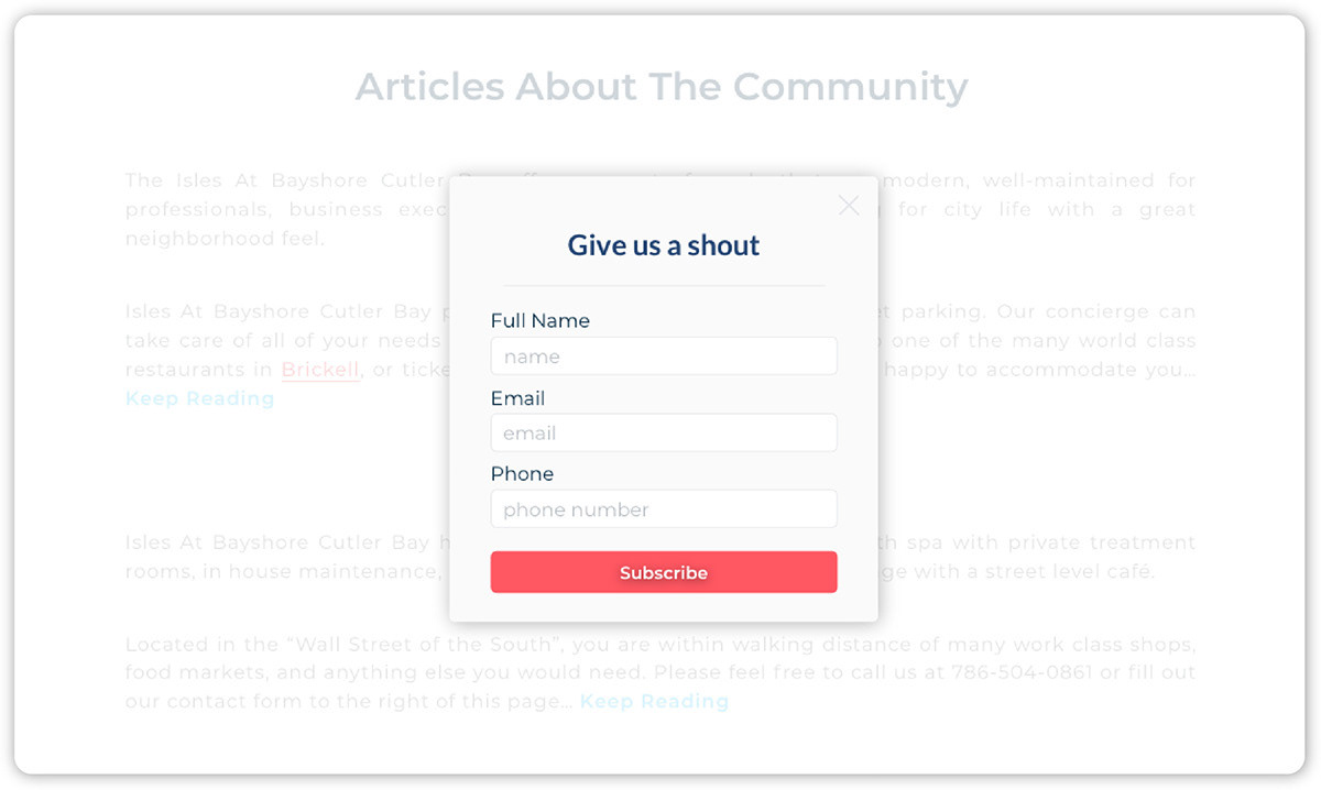
Pop-up to capture leads and trigger an automated email introducing the most relevant agent.
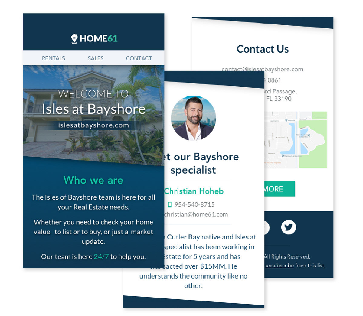
Marketing emails I designed and programmed in MailChimp to send automatically after sign-up.
Website Speed: The website loading speed was over 4 seconds. The development team was able to cut it down to less than 1 second. This was possible by reducing the number of images and content displayed on the new design I proposed.
Engaging Content: We decided to create a dedicated section with relevant content about the industry to rank higher on Google searches. Our copywriter wrote the articles, and they were all original content.
Customer Service: Our consultant team worked on decreasing the response waiting time on Chatlio from an average of 1:30min to 25seconds.
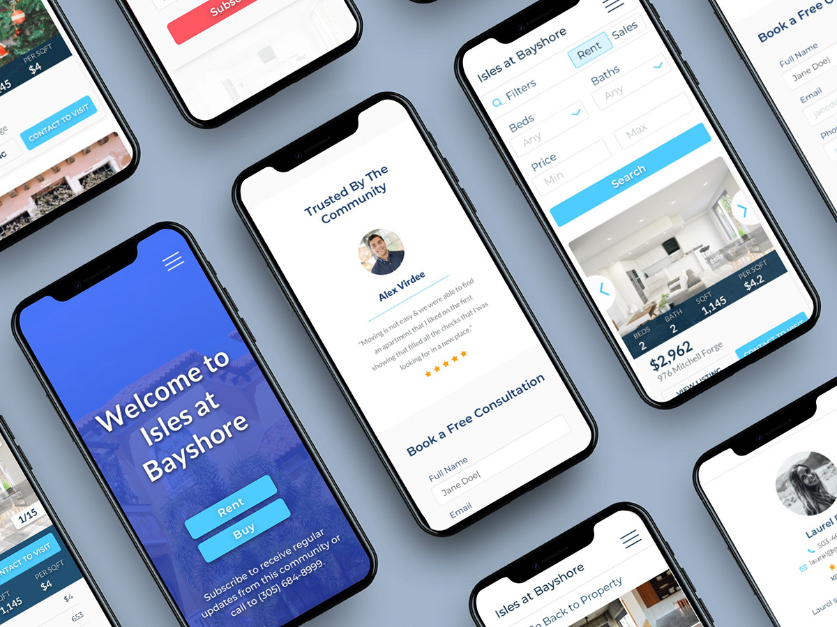
Redesign
For the redesign, I focused on keeping a professional but fresh look. The main color used was blue, with a red CTA, which after some A/B testing was the best one to perform. The content remained very close to the original, except for some sections that were taken out to optimize screen loading time.
Given that the scope of this project was very large, I had to design several screens for the new layout to keep cohesiveness throughout the navigation experience. Below I have added some examples of a few of them.
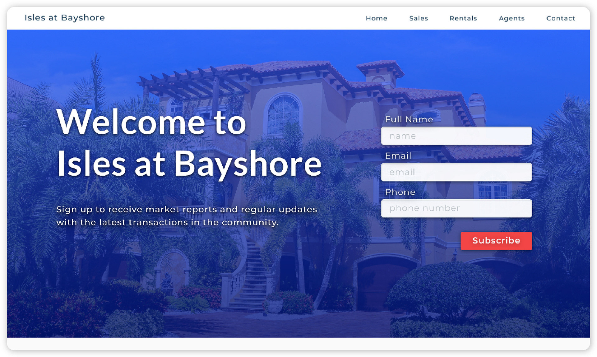
Landing Page
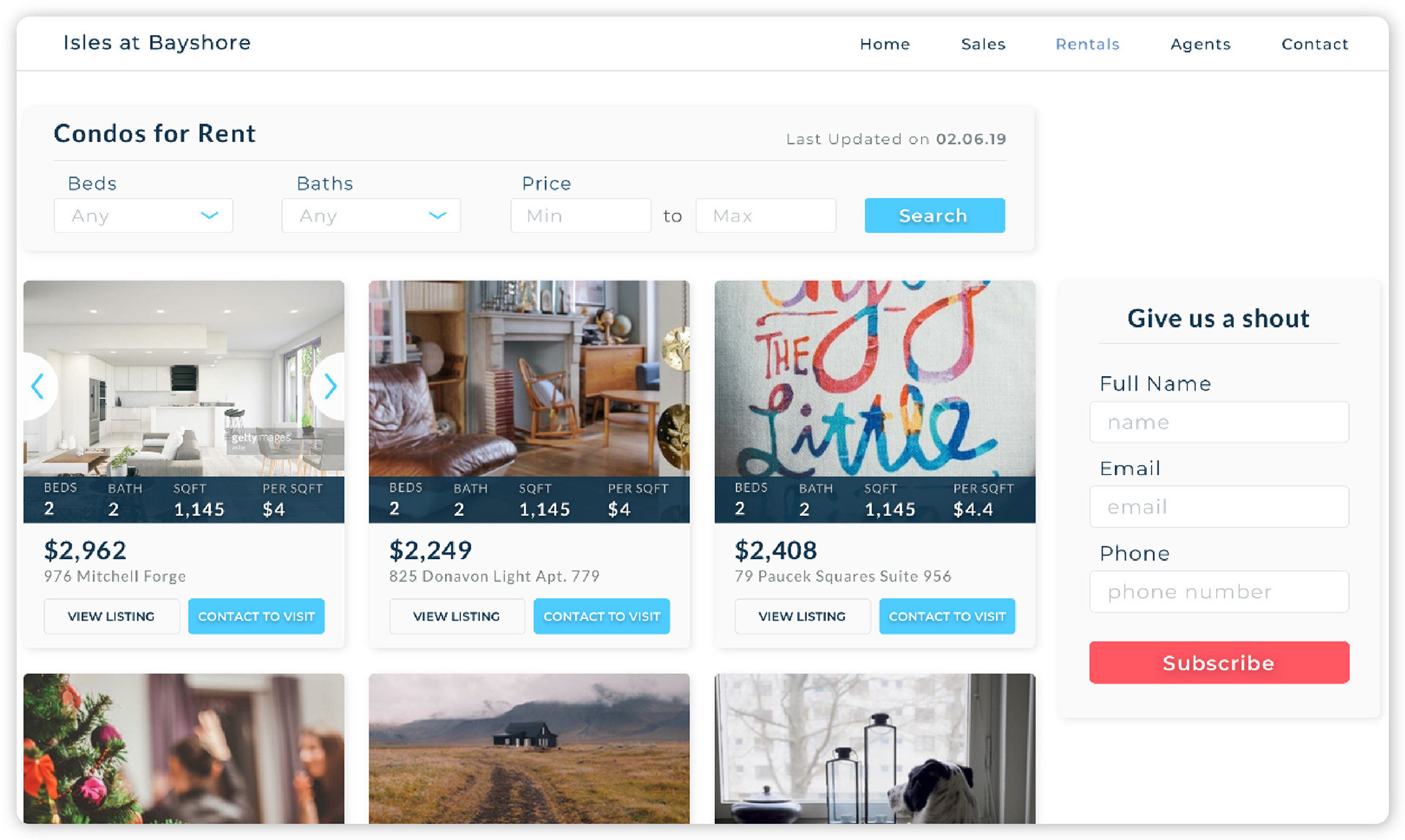
Search Screen
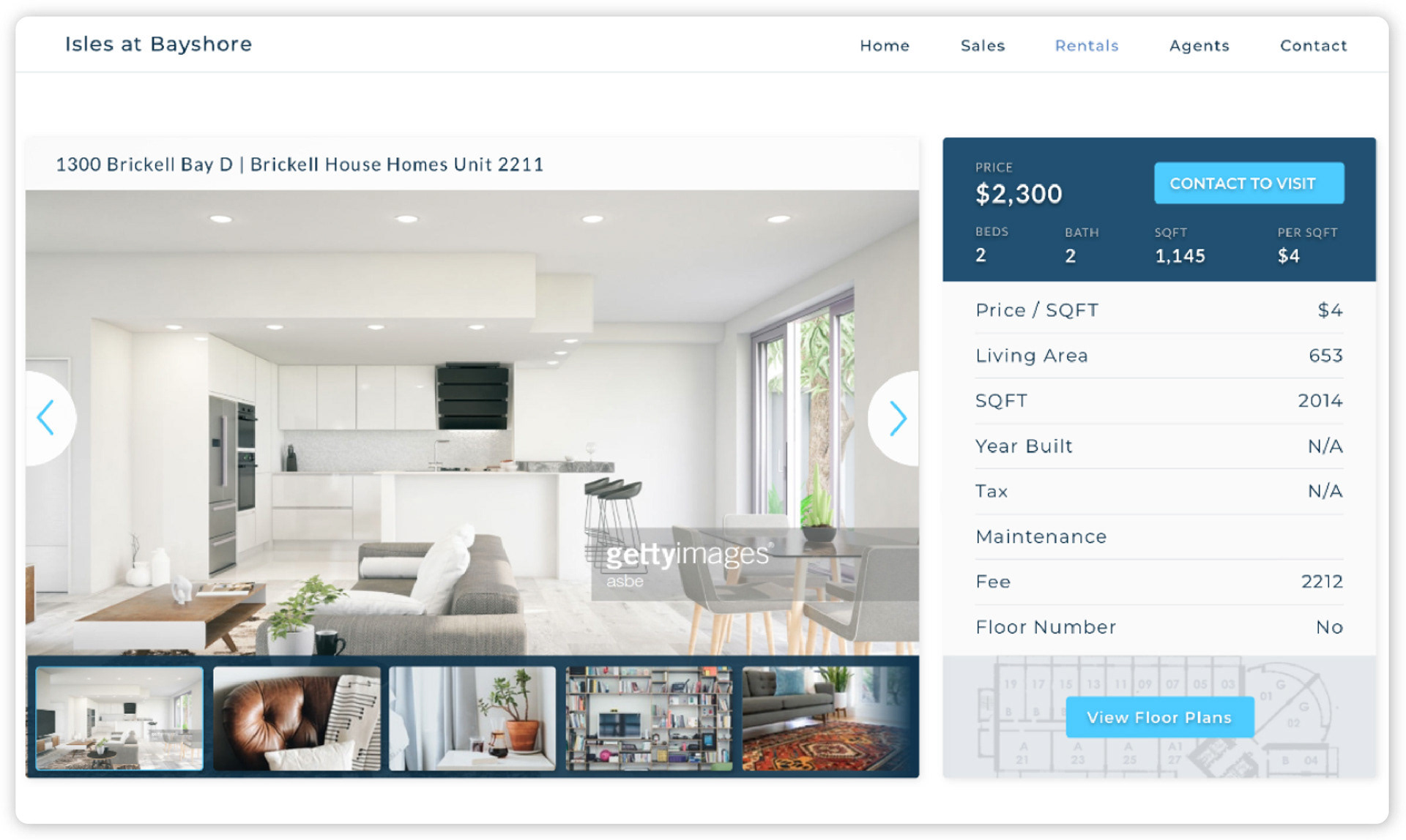
Property Details
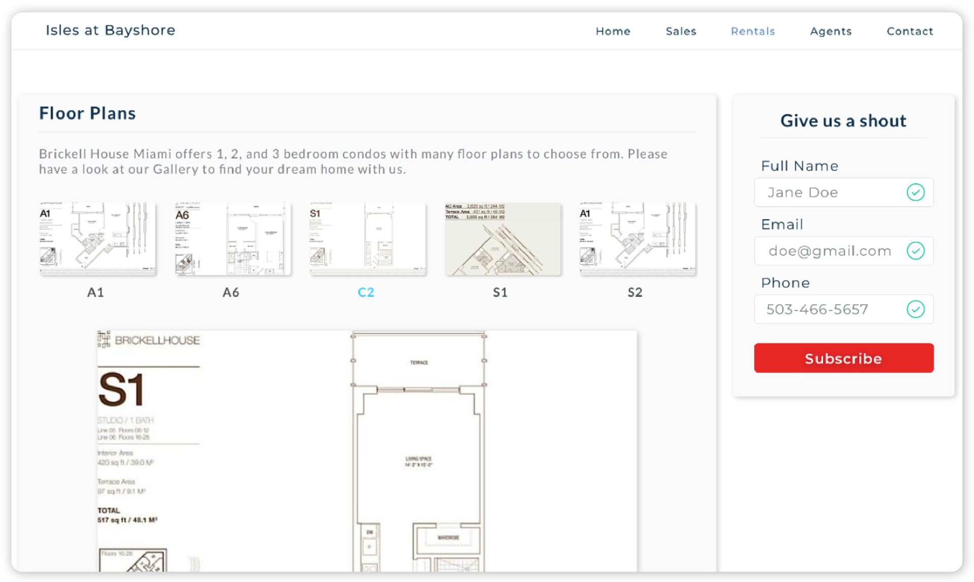
Floor Plans
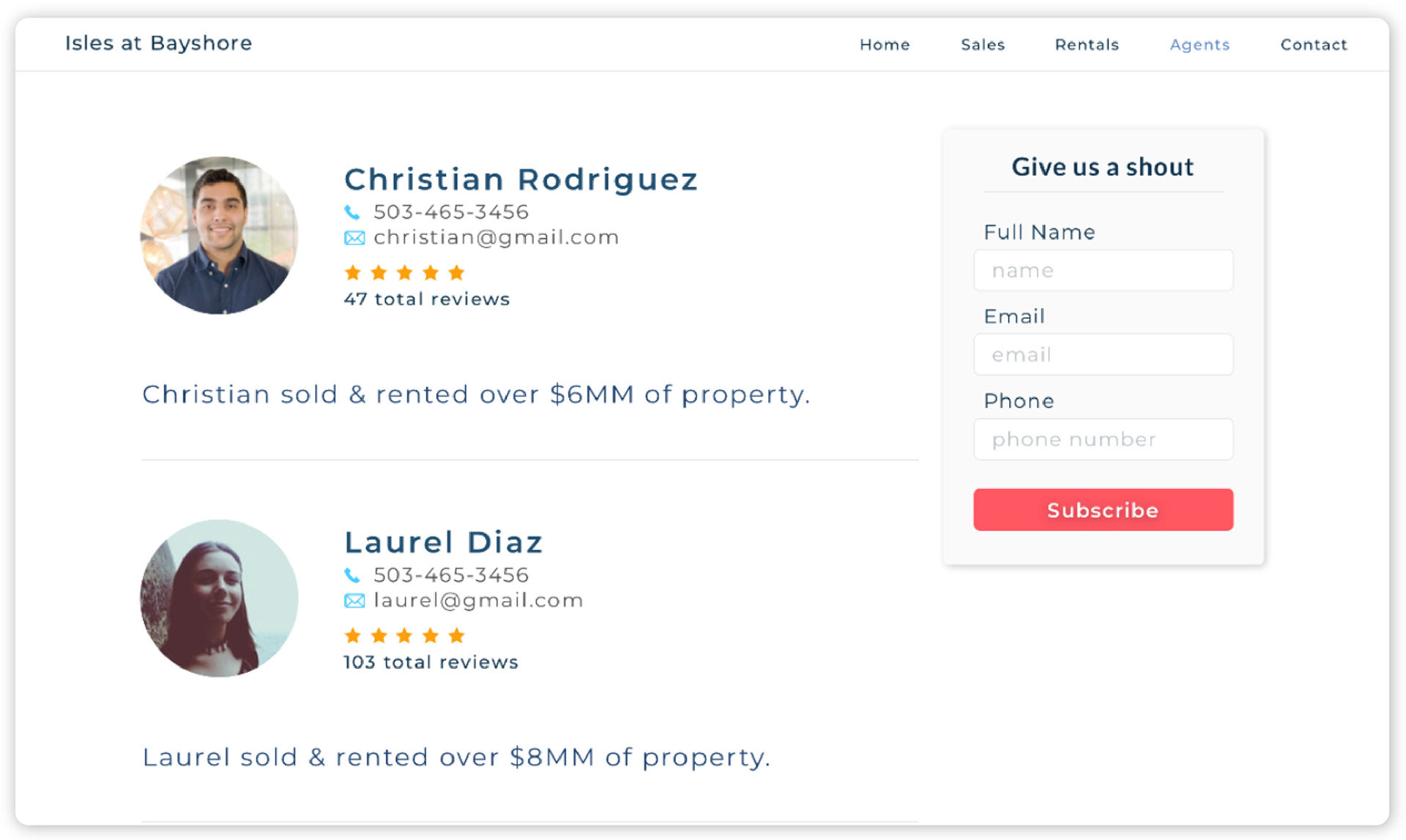
Agent Screen
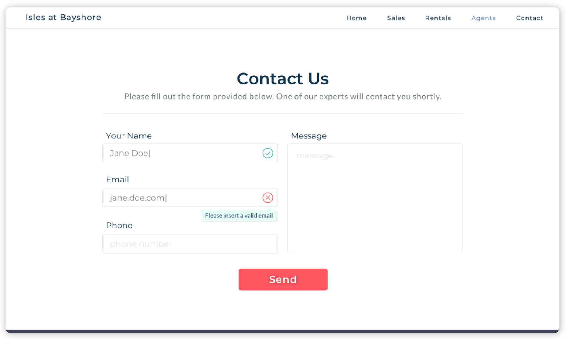
Contact Screen
Results


Takeaways
Although the redesign of the experience was the main focus of the project, we were able to exceed expectations thanks to the collaborative effort of everyone on the team.
The final results reduced the lead capture cost from $65 to only $11, and the lead generation went from an average of 40 to 90 per month, for a total increase of 125%.