Brief: Sole designer in a cross-functional team working with a PM and engineers to improve the “Apply for Fetch Pay” flow.
Fetch Pay is a debit card under Fetch Rewards created to expand into the financial space. The product faced high drop-off during sign-up and low card activation after approval. I focused on identifying blockers and redesigning the experience to drive conversion, activation, and usage.
Problems
• 43% of drop-offs in the "Apply for Fetch Pay" flow before completing 60% of the process.
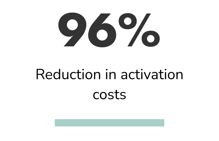
• We were spending $21 per customer on 2-day Express Shipping, only 45% of our users activated the card after approval.
Goals
1. Increase conversion in the "Apply for Fetch Pay" flow.
2. Get more users to activate their cards after approval.
3. Find incentives for using the card so it becomes part of their wallet.
User Research
I partnered with one of our user researchers to conduct interviews with users who had been through the flow to apply for the card.
We conducted semi-structured interviews + prototype user walkthroughs via UserTesting.com.
We included in our sample users who had completed the application process and others that had abandoned it.
Themes uncovered:
• 80% of the users expressed concerns about privacy and security when signing up.
• Two users mentioned the sign-up process was too easy. They assumed that it was an account sign-up.
• Debit versus Credit. Confusion about SSN requirement.
• Misconception about background check requirements.
• 50% of users that did sign up, went through with it because they trusted Fetch first and foremost.
Design made by the previous designer before I took over the project
Industry standards
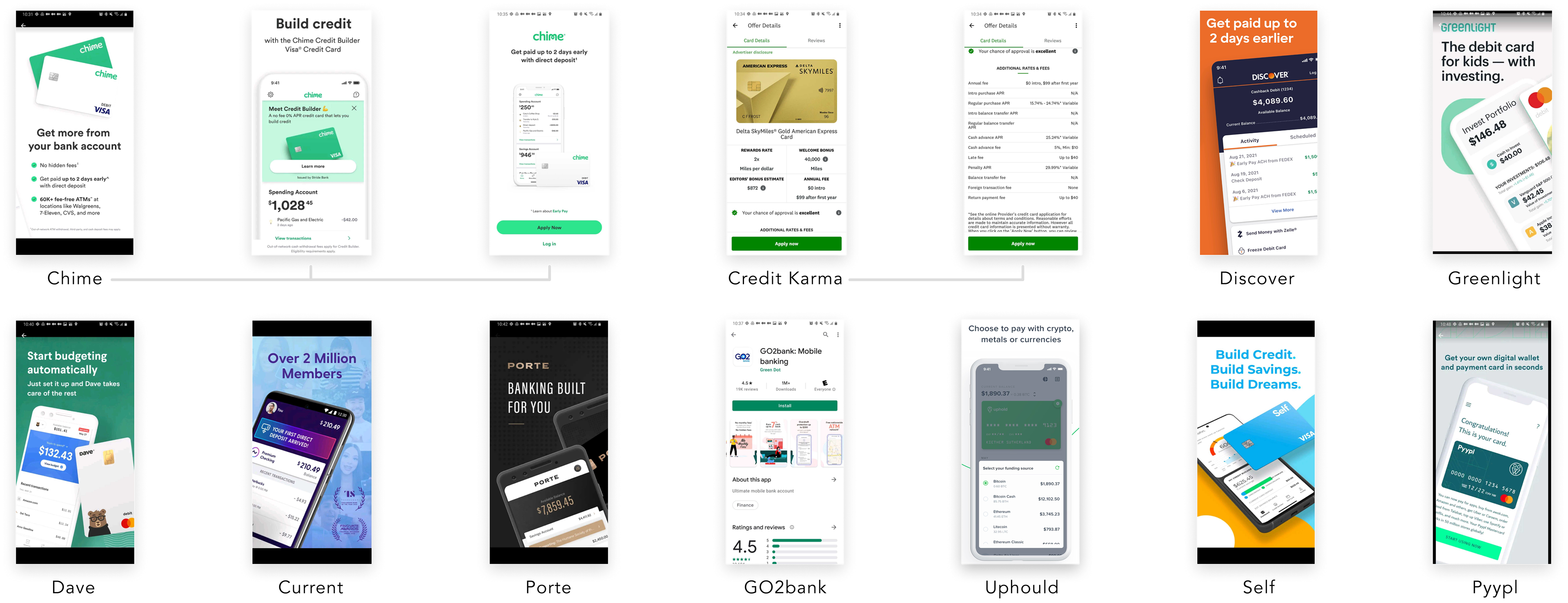
I dived into industry standards, mainly looking into less-known online banking companies, which had systems more visually appealing than established institutions.
I also studied others that weren’t banks but were part of the financial sector, such as Credit Karma and Mint.

Wireframes
This project had a quick turnaround, so I took existing components from the previous design and our design system.
For this reason, I jumped straight to the high-fidelity wireframes.

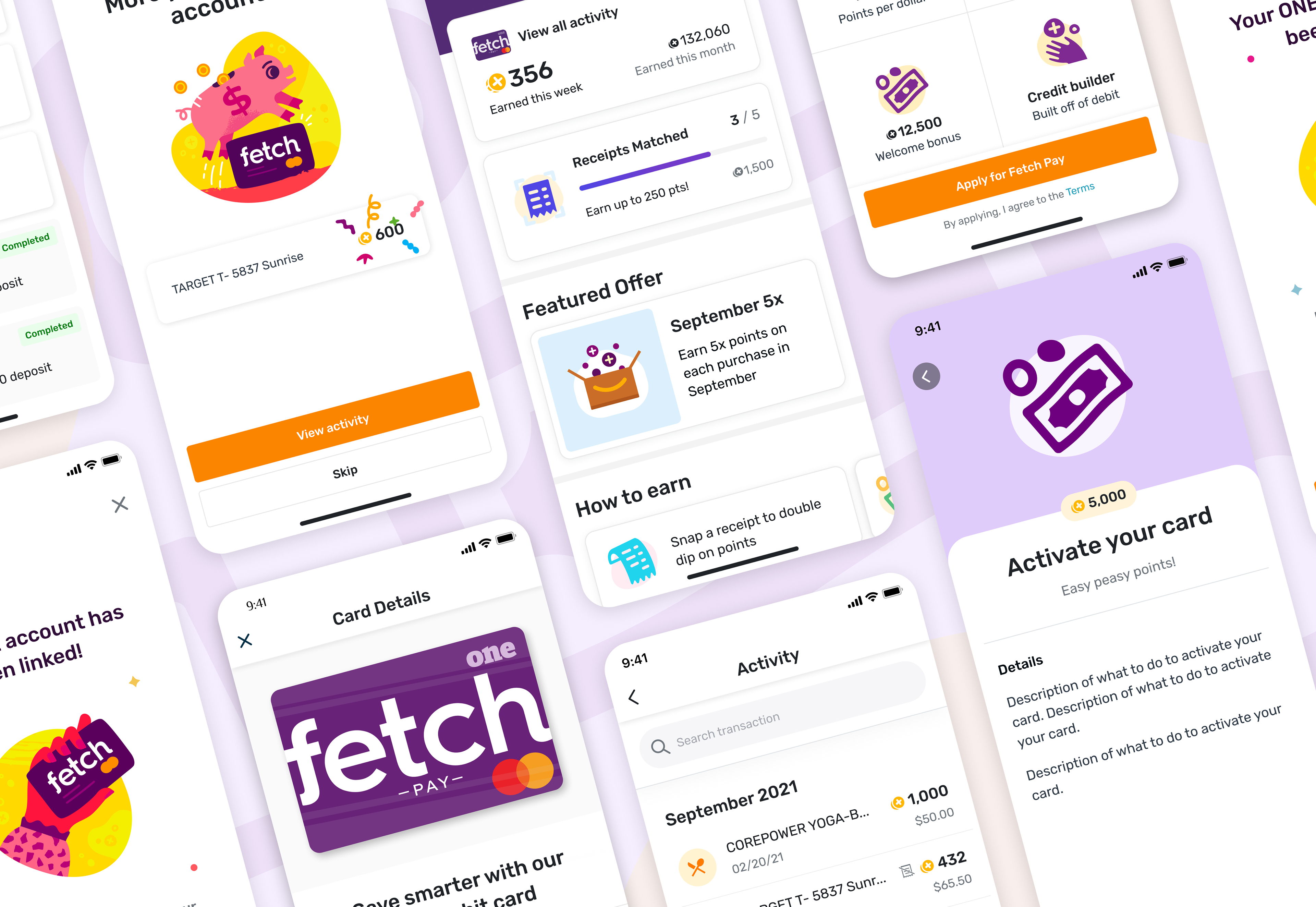
Solution
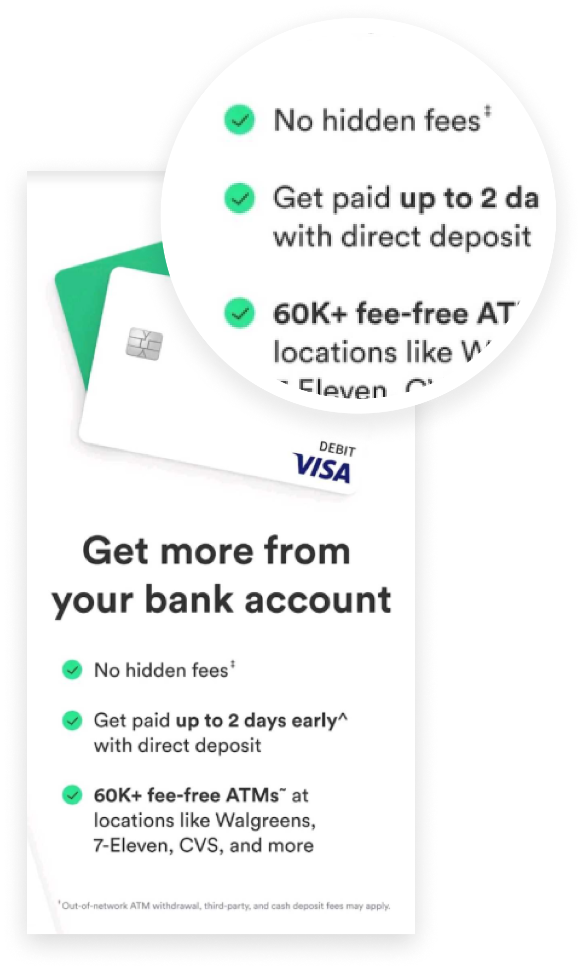
Based on our research, we identified that users needed to trust the product quickly and understand what it was offering. Our solution delivered all critical information at first glance, using short, digestible sentences.
These addressed two main concerns:
1. Trust and Safety
We aimed to remove friction and skepticism:
• Clearly stated no background check required, reducing perceived risk.
• Emphasized no credit inquiry, since it’s a debit card, not a credit card.
• Reinforced security and fraud protection measures.
• Highlighted responsive customer support.
• Included real user reviews for social proof.
2. Product Understanding and Value
We made it easier for users to quickly grasp what the product is and why it’s valuable:
• Clearly differentiated it as a debit card (not a credit card), while still showcasing rewards and benefits typically associated with credit cards.
• Promoted exclusive offers and sign-up bonuses upfront.
• Delivered all these key product highlights in concise language.
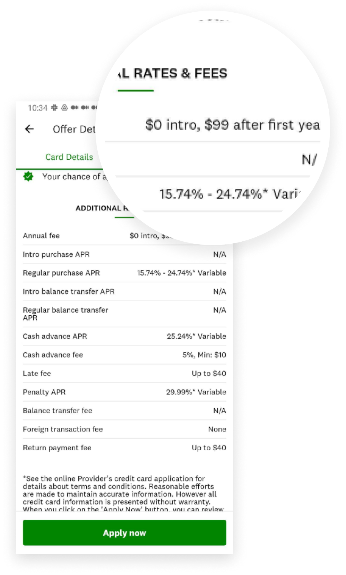
The copy was probably one of the areas that took the most time, as I had to work with our copywriter condensing it, and then going back and forth with our banking partner to make sure it was legally correct.
I also highlighted other benefits that weren’t included initially but were important for our partner, such as overdraft protection.
End result
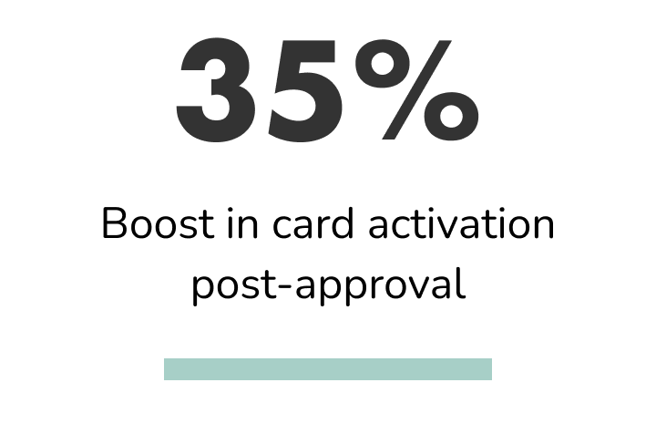
Increasing card activation
When I jumped into the project, the company was paying for 2-day express shipping, thinking that the problem was that users were forgetting they ordered the card.
I signed up for the card to go through the experience our users were having, and I realized the card came in a non-branded, white envelope. Since I didn’t know what it contained, it was sitting on my table until the weekend, when I usually open all the mail. I thought that perhaps our users were experiencing the same, throwing it away without even opening it.
I commented on this to the VP of Product and proposed creating branded envelopes. It took more money upfront, but the result was definitely worth it.
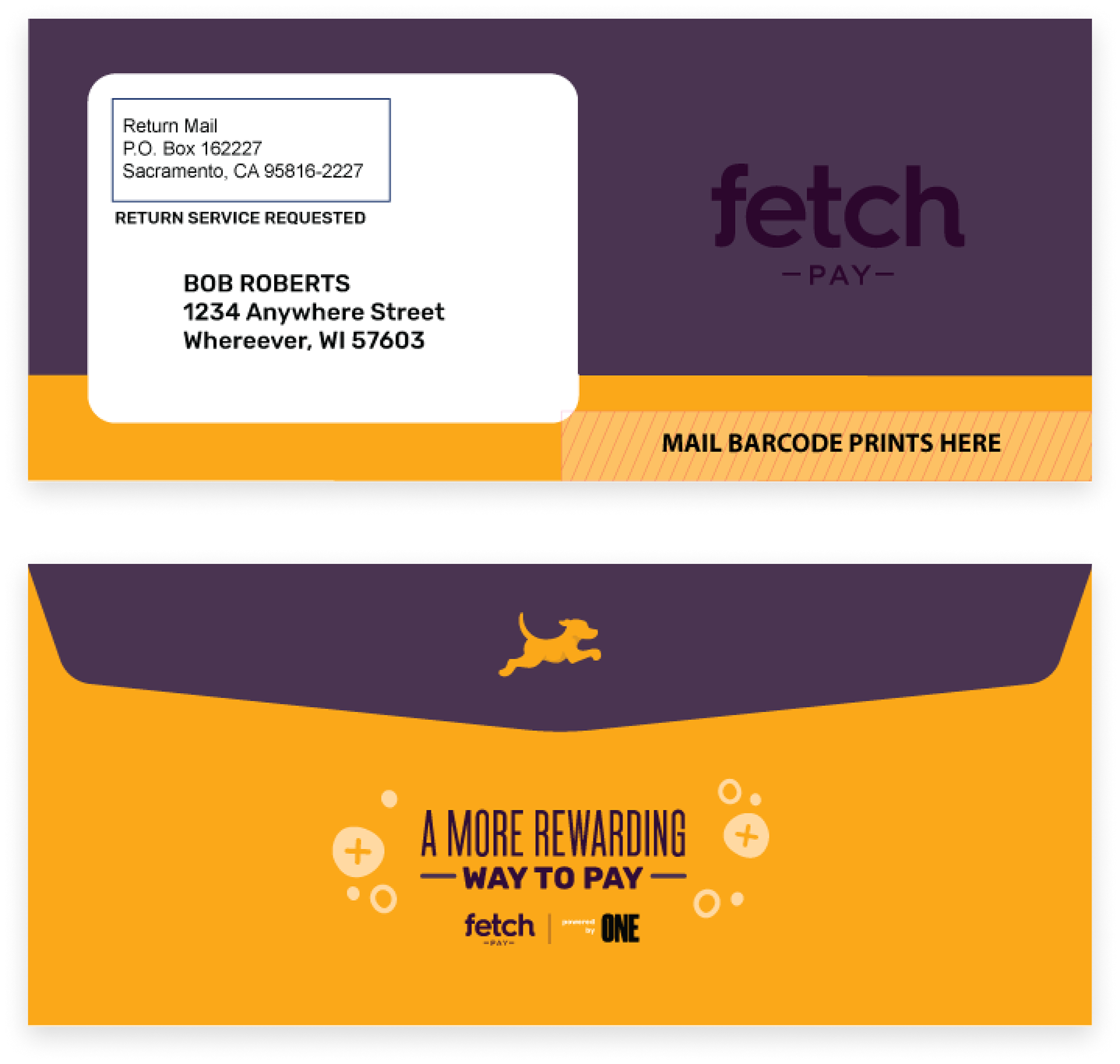
Envelopes created by the Marketing team
The envelopes here were designed by the Marketing team. I was concerned about the contrast between the “Fetch Pay” logo and the lack of information, but they mentioned that since it contained sensible data and it was a debit card, we couldn’t clearly state anything related to it for security reasons.
Results
Exploring further engagement
Since most debit cards do not offer theft protection, I thought that a way to make our users feel more comfortable paying with our card was by not having it physically, where they could lose it.
I proposed adding it to their digital wallet so they could access it via their smartwatches, which are one of the most common and used wearable technologies today. This solution is still in the backlog.
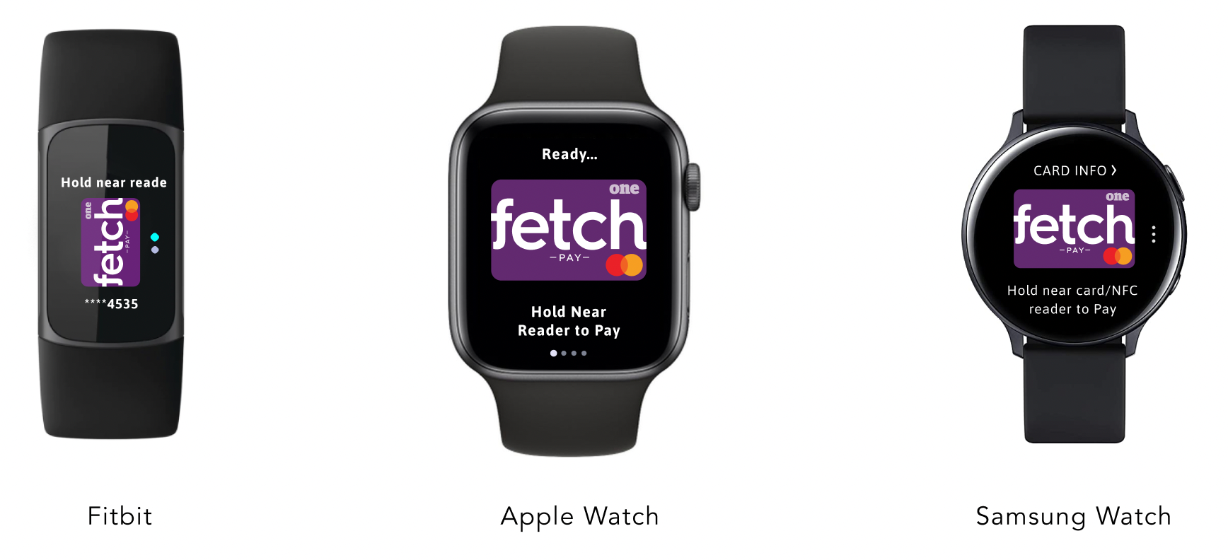
Mock-up with three of the most commonly used wearables in the industry