PlantMe
Designing the end-to-end experience for a C2C platform connecting gardening specialists with clients for services like landscaping, with PlantMe earning commission on bookings.
Goals
App launch, service search, and feedback systems.
1. Create a native app for both Android and iOS that allows contractors to showcase their services.
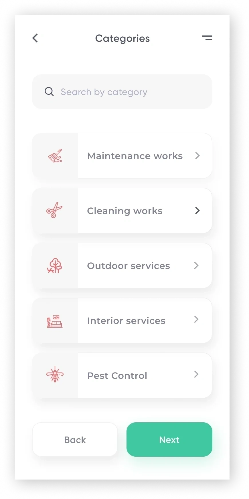
2. Enable search for services using filters such as landscaping type, dates, location, and price, and search for specific types of landscaping, such as maintenance, mowing, and pest control.
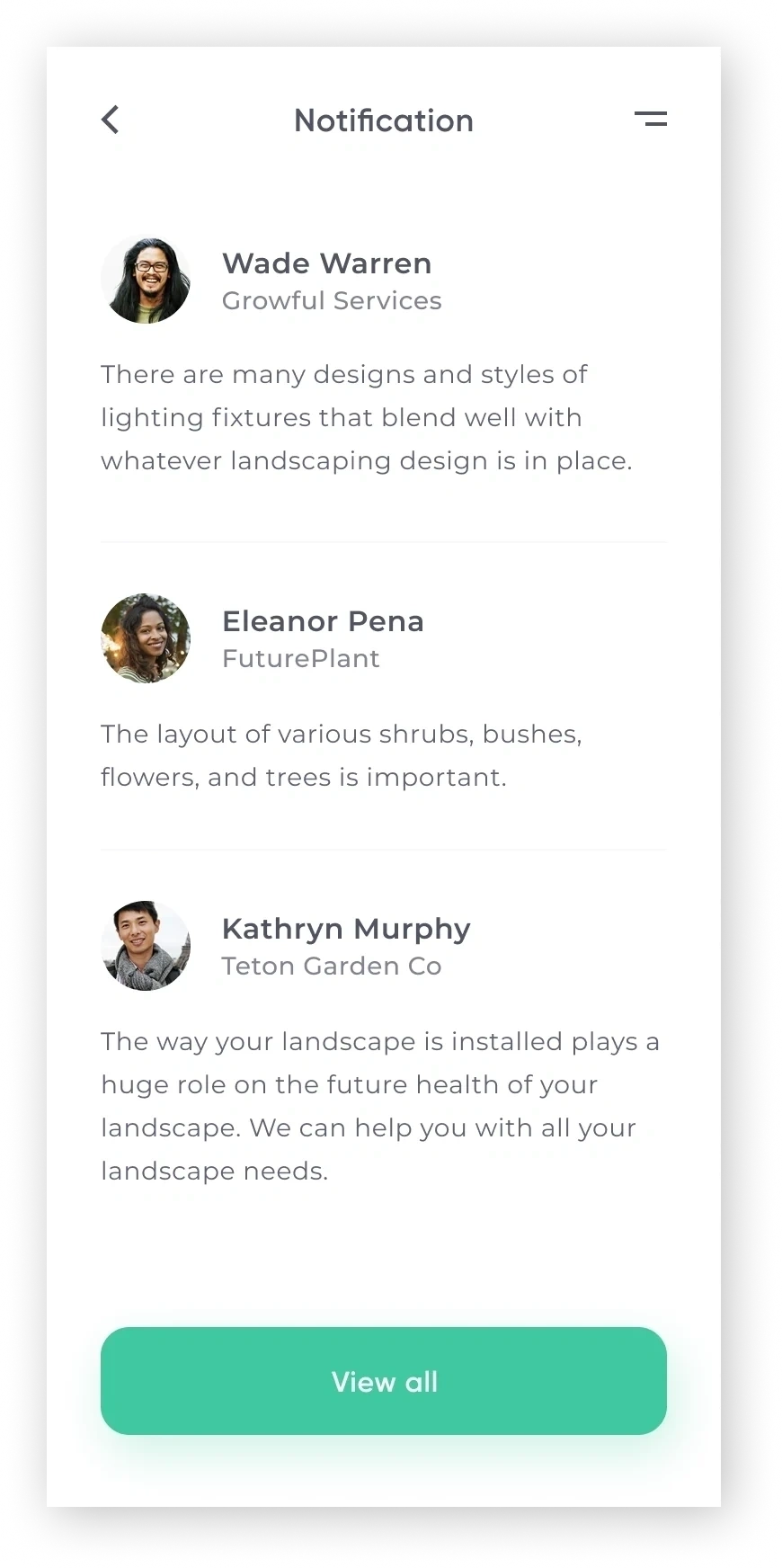
3. Design a review-based system where clients and contractors can rate the experience.
Market Research
Familiarizing with the landscaping industry.
Beginning with market research, I spent some time familiarizing myself with the landscaping industry. I wanted to learn more about the market for PlantMe.
Key findings:
- The landscaping industry generates $93 billion in annual revenues.
- Employs more than 1 million people annually.
- Has an annual growth rate of 3.5%.
- Consists of nearly 500,000 businesses.
Competitive Analysis
Benchmarking competitors to identify opportunities.
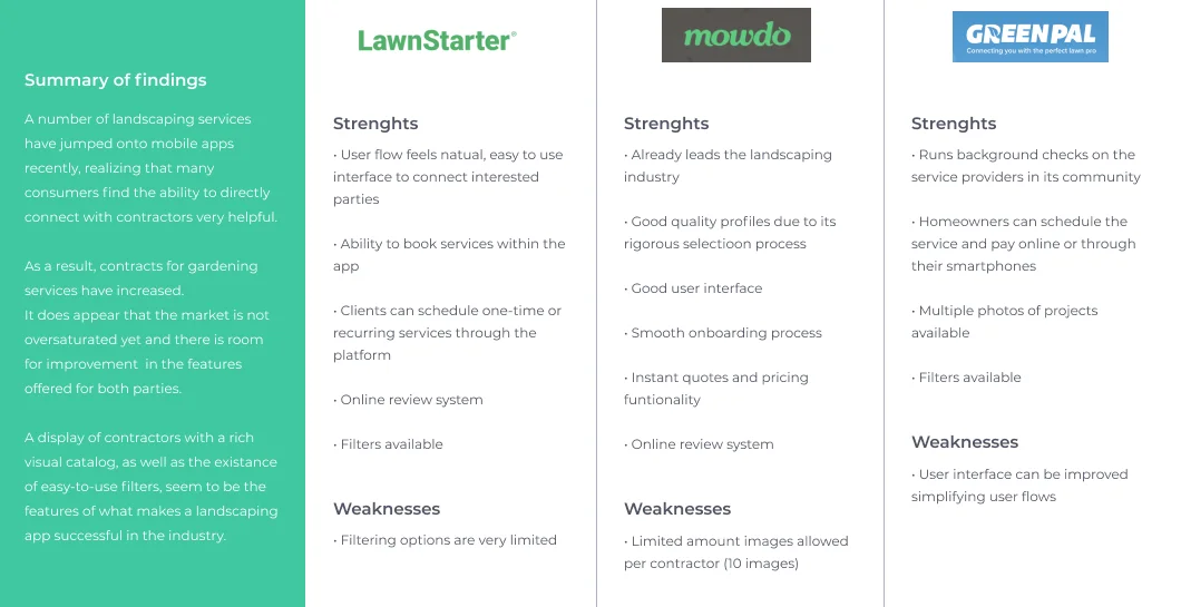
To get a better understanding of the competitors, I performed a competitive analysis by downloading 3 landscaping apps that offered similar functionalities to identify their strengths and weaknesses. This allowed me to learn how other apps approached connecting customers with contractors, and what opportunities were available for PlantMe to distinguish itself.
User Research
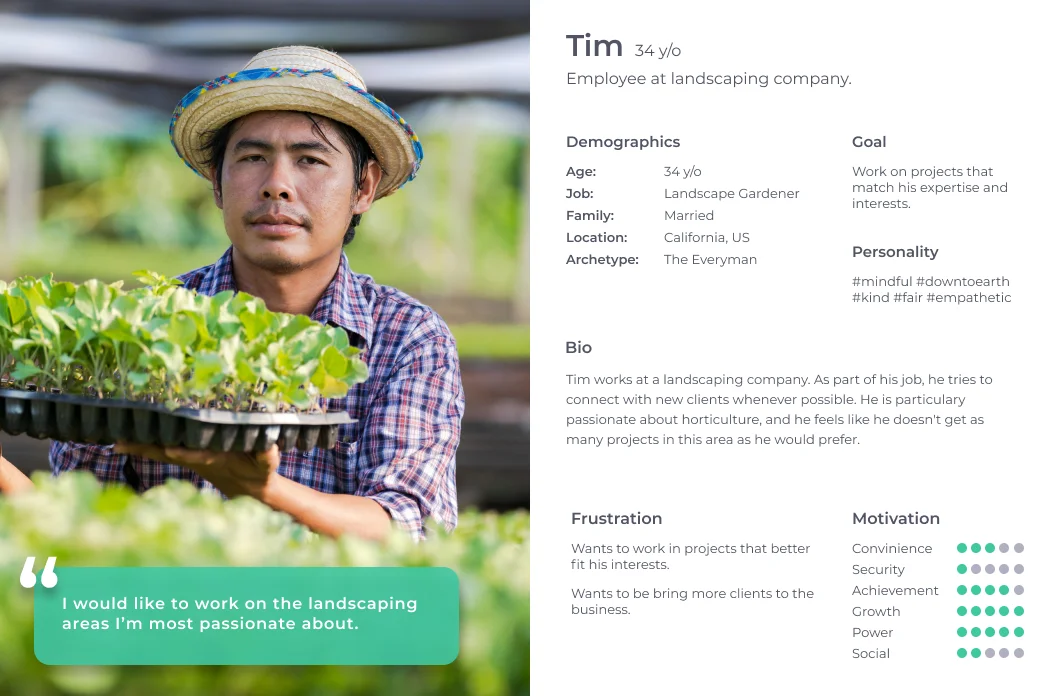
Conducting interviews and defining user personas.
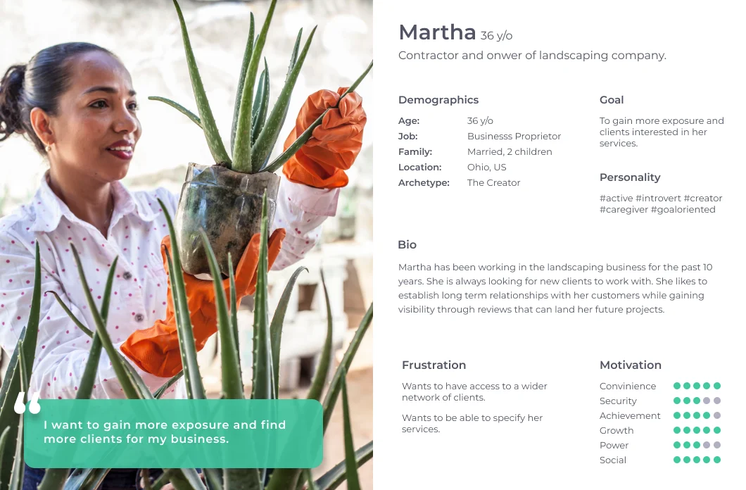
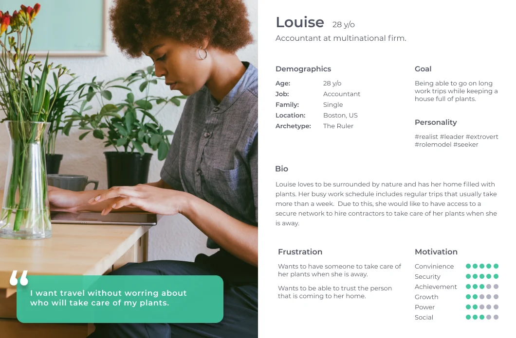
To better understand the members of the community, I conducted my research by creating an interview guide to use during 1-on-1 interviews, focusing on user needs. I conducted 3 interviews with participants of different backgrounds ranging in age from 28-36. Two of the participants had experience as contractors in the landscaping industry and one of them was a potential customer for the end product.
Based on their feedback, I created personas to represent our users' needs, experiences, behaviors, and goals. It also helped me to identify the users I was designing for and their expectations. Understanding the clients and their needs was the number one priority, and based on that, I set the MVP scope of the project.
The app targeted users looking to offer professional services, as well as individuals looking to fulfill tasks that they couldn't perform.
MVP Core Features
After addressing user needs, these were the features we decided to focus on for our MVP:
- Infinite scroll gallery showcasing recently posted projects.
- Direct Messaging screen where users can connect with contractors/clients.
- Review-based system visible on contractors' and clients' profiles.
Sitemap
Organizing navigation and architecture.
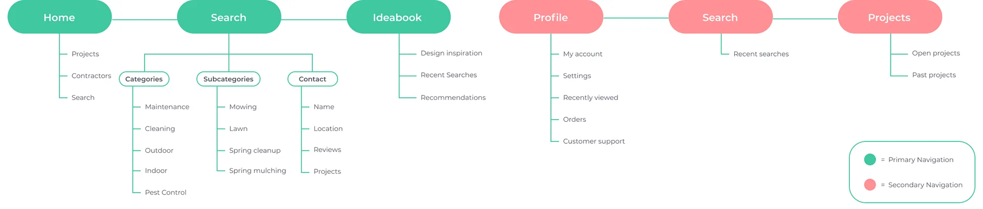
I wanted to keep the sections of the app organized neatly and easy to navigate for the user. Noticing how other landscaping design apps were structured, I created the primary navigation with three sections:
- Home: Where users could see the latest projects posted around the area, contractors, and a basic search form.
- Search: A dedicated search screen with tailored filters.
- Ideabook: Where users could save projects they liked or services they were interested in.
I also created a secondary navigation with user details and a contact feature.
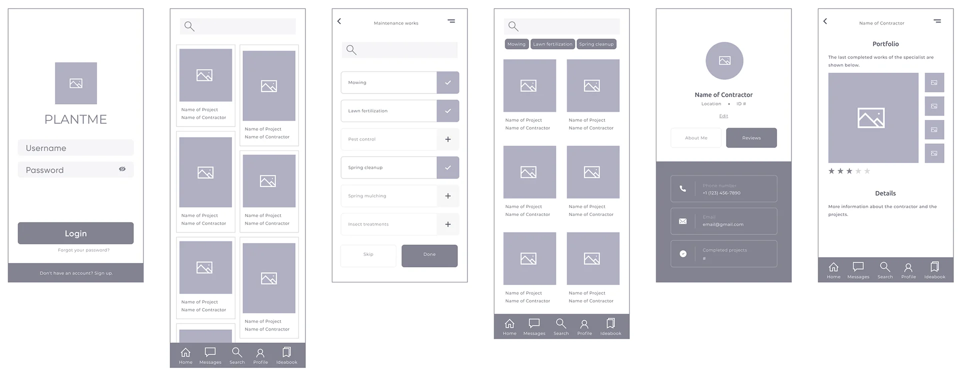
Wireframes
Mapping flows and wireframe sketches.
I created two flows:
- Flow 1 (Gallery-oriented): A user going through the infinite scroll image gallery, clicking on a project to learn details, going to the user's profile screen, and contacting the contractor or client.
- Flow 2 (Search-oriented): A search-oriented journey with filters that allowed clients to locate contractors in the selected categories, then display the results, go through the contractor's profile, and learn more about previous projects.
In order to focus on what I wanted the users to accomplish in my MVP, I created two main task flows: user views recently posted projects, and user finds a contractor using filters.
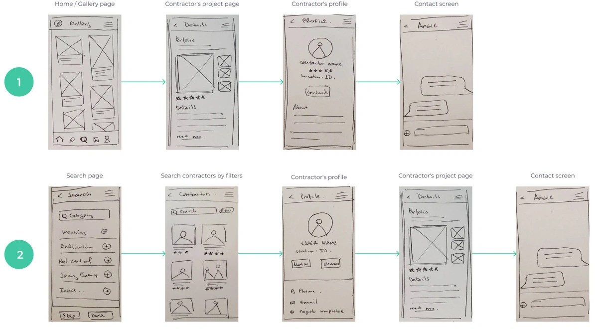
Paper wireframe sketches
User journey task flows
Prototype
Mid-fidelity prototyping and feedback cycles.
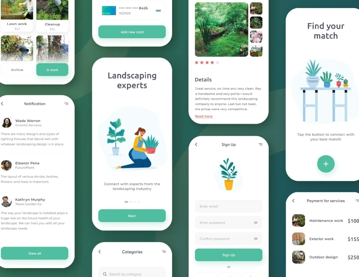
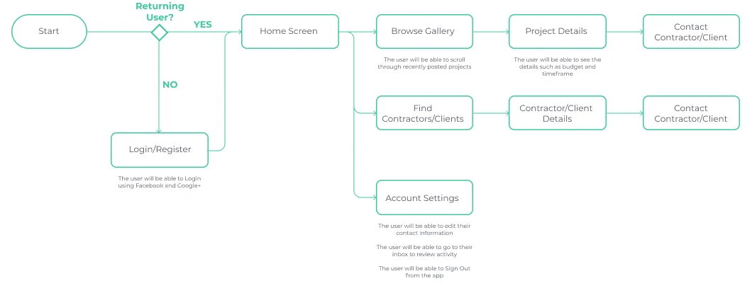
After logging in, users navigated to the homepage where they could view recent projects or search for specific ones by using the filtering tool. While gathering feedback from the prototypes, we realized that it would be more convenient for the user to directly access the message feature and the account details from the primary navigation bar.
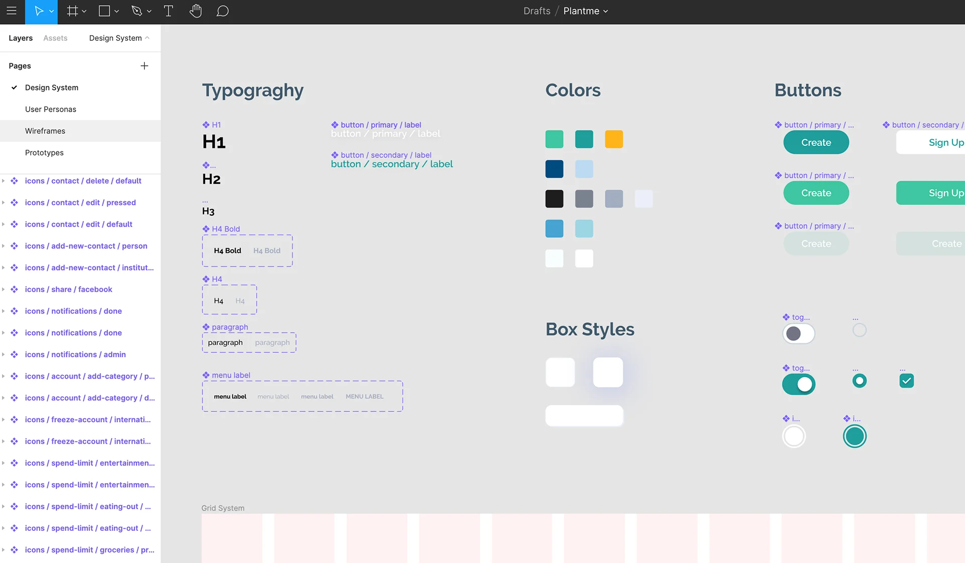
Design System
Style tile development for product scalability.
Once I had the product direction defined, a cardinal step was coming up with a design system that allowed scalability. This was necessary to make sure the product ran straight on the line and had a good foundation. That way, when the time to add new features, screens, or modals came to be, there wouldn't be any major alterations or questions about how to proceed.
Testing
High-fidelity prototype and usability testing.
I created a high-fidelity prototype for users to interact with the MVP during usability testing. I presented my high-fidelity prototype to four testers using Figma Mirror and asked them to perform the actions I was focusing on for the MVP. Everyone was able to navigate them successfully.
Most of the feedback was focused on UI elements, such as the navigation bar color, text weight and size, and selection of icons.
The page that needed the most revision was the Contractor Details screen, where the users preferred seeing the overall ranking of the contractor. The "About me" was resolved by displaying the information on the same page. I also changed the call to action to a direct "Message" button and a "Request a quote", as they preferred to directly connect through the app if possible.
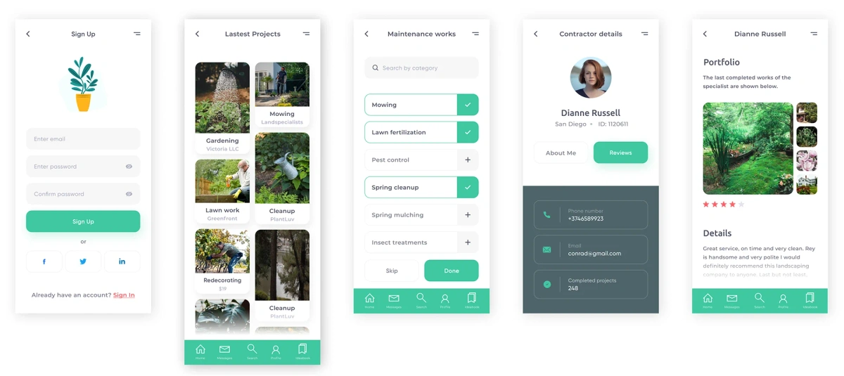
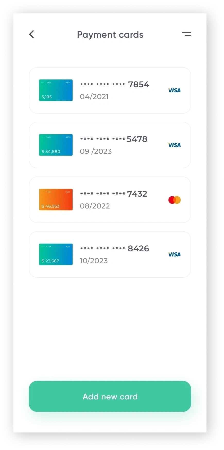
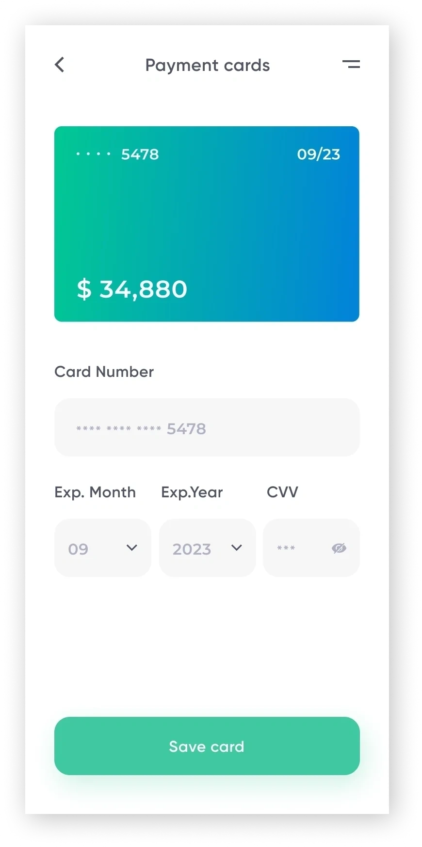
High-fidelity mockup screens
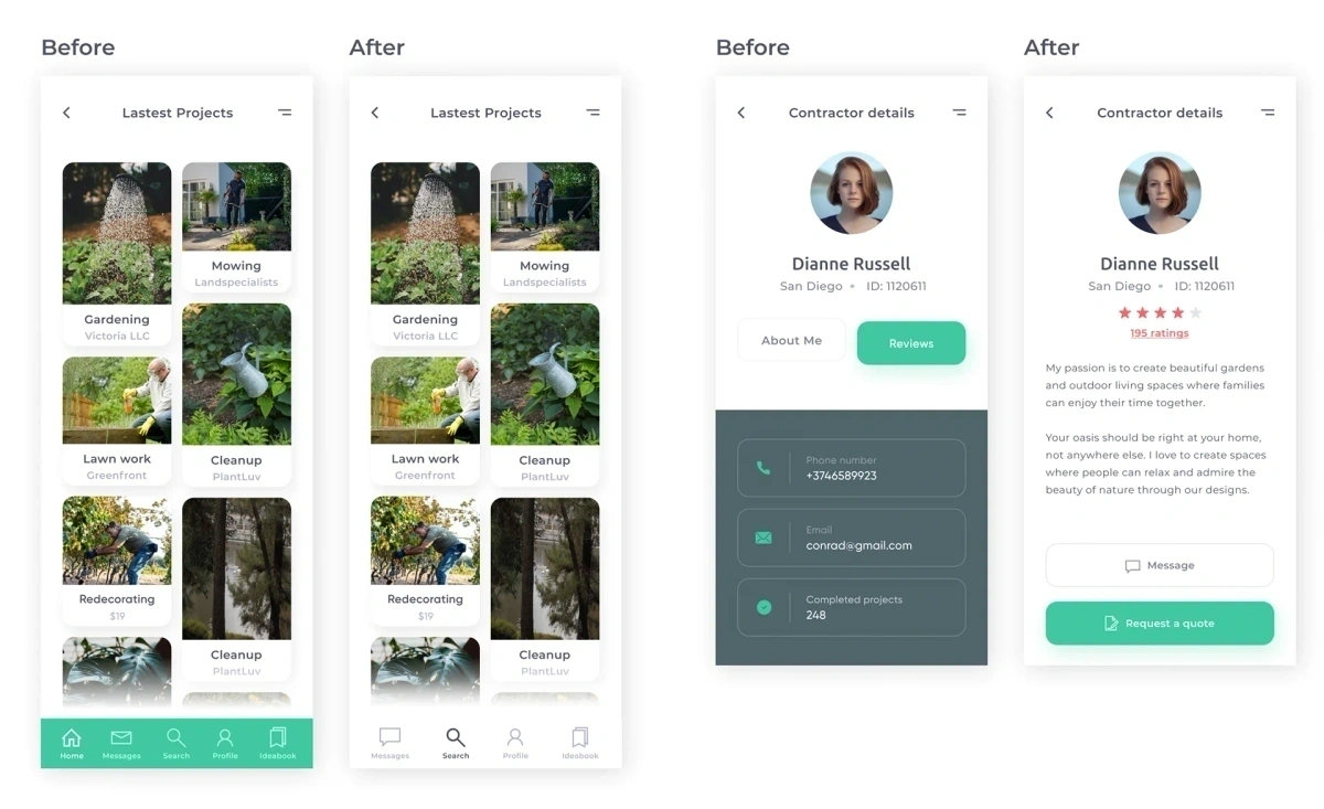
Usability testing revisions
Interactive Model
Try out the live prototype in Figma.
Developed Screens
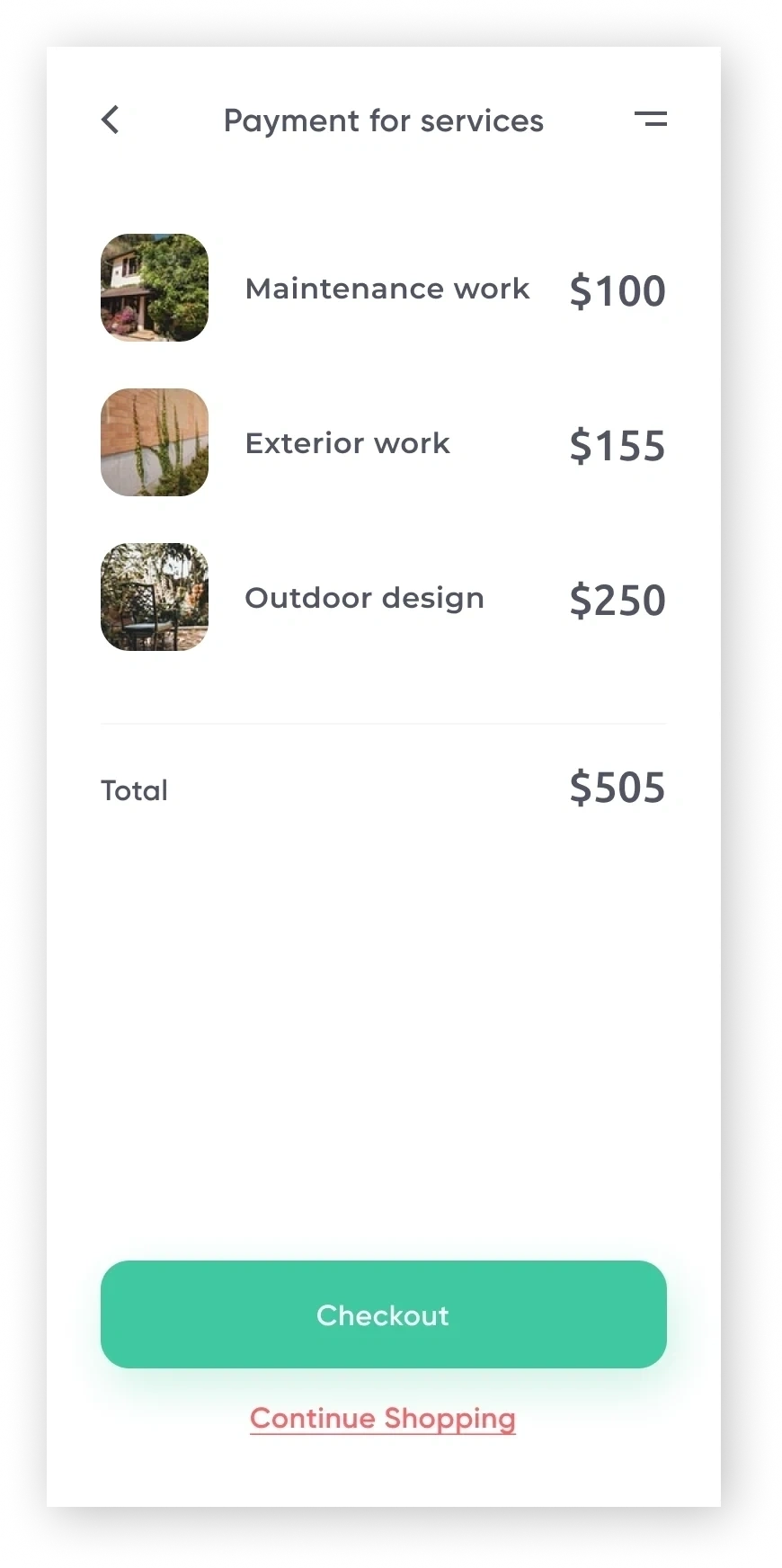
Responsive layouts for onboarding and checkout.
As the project moved forward I worked on the onboarding screens and the checkout flow. A grid of some of these developed screens is shown below:
Takeaways
The impact of modular visual guidelines.
Designing a C2C service platform from 0 to 1 taught me the value of structured visual guidelines and modular components early. It allowed our engineering pod to move straight from mid-fidelity iterations to final code-ready layers without confusion.


