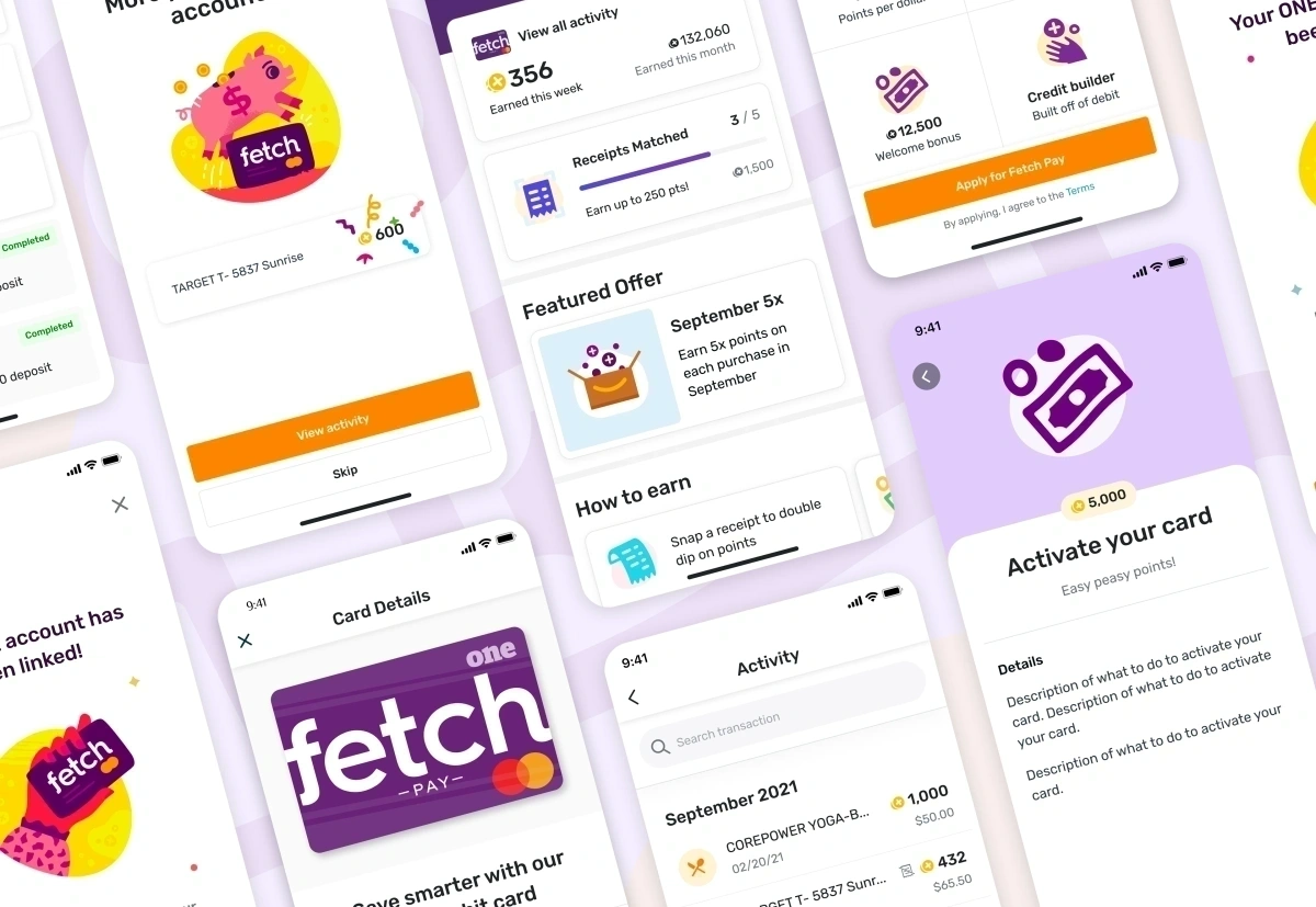
Fetch Pay
Sole designer in a cross-functional team working with a PM and engineers to improve the "Apply for Fetch Pay" flow. Fetch Pay is a debit card under Fetch Rewards created to expand into the financial space. The product faced high drop-off during sign-up and low card activation after approval. I focused on identifying blockers and redesigning the experience to drive conversion, activation, and usage.
Problems
High drop-offs and costly activation friction.
First, user drop-off was a major issue: 43% of users abandoned the "Apply for Fetch Pay" flow before completing 60% of the onboarding process.
Second, card activation costs were high. We spent $21 per customer on 2-day Express Shipping, yet only 45% of users activated their card after approval.
Goals
Ambitious metrics for growth and wallet share.
1. Increase conversion in the "Apply for Fetch Pay" flow.
2. Get more users to activate their cards after approval.
3. Find incentives for using the card so it becomes a primary option in their wallet.
User Research
Conducting interviews and prototype walkthroughs.
I partnered with one of our user researchers to conduct interviews with users who had been through the card application flow. We conducted semi-structured interviews and prototype user walkthroughs via UserTesting.com, sampling users who completed the application and others who abandoned it.

Themes uncovered:
- Privacy & Security Concerns: 80% of users expressed concerns about privacy and security during sign-up.
- Accidental Application: Two users mentioned the sign-up process was too easy, assuming it was just a standard account registration rather than a banking product.
- Product Confusion: Confusion between Debit versus Credit and why an SSN or background check was required.
- Brand Leverage: 50% of users who did sign up did so because they trusted Fetch first and foremost.
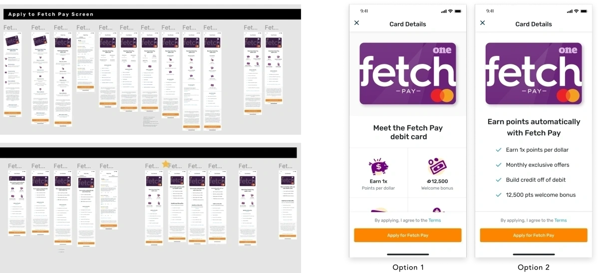
Flow Comparison
Comparing the visual transitions of onboarding.
To compare the visual transitions and see how the layout evolved, the previous layout (designed prior to my ownership of the project) was compared side-by-side with the proposed onboarding overhaul:
Previous design flow (high drop-offs)
Redesigned onboarding flow (improved trust and clarity)
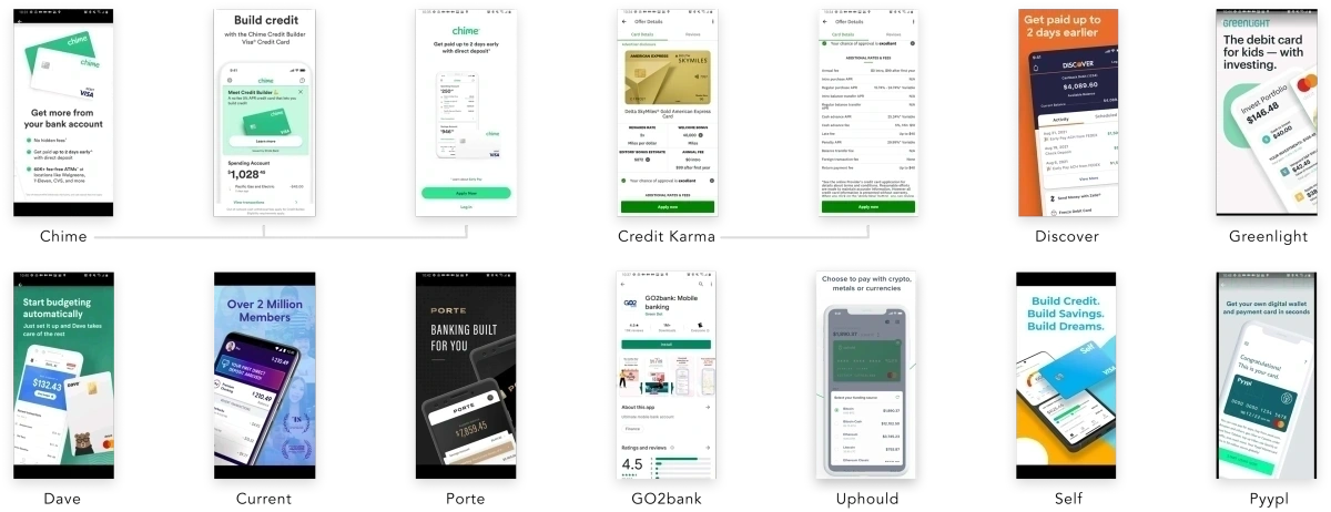
Industry Standards
Benchmarking modern fintech design patterns.
I dived into industry standards, mainly looking into less-known online banking companies, which had systems more visually appealing than established institutions. I also studied others that weren’t banks but were part of the financial sector, such as Credit Karma and Mint. A recurring theme emerged: key information was served up front.

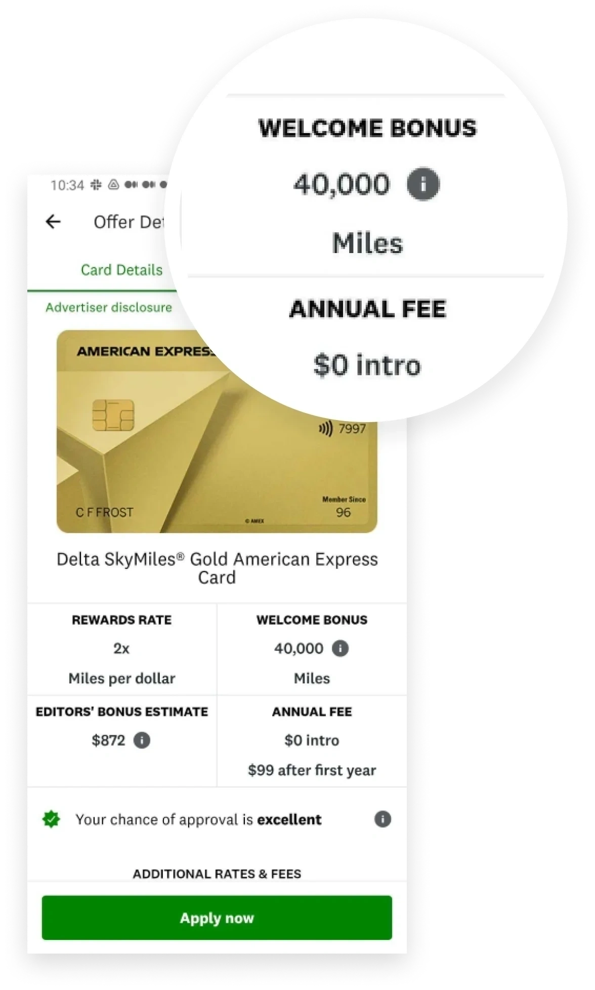
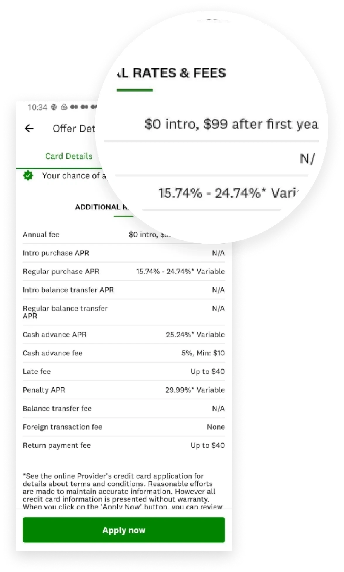
Solution
Designing for trust, clarity, and compliance.
Based on our research, we identified that users needed to trust the product quickly and understand what it was offering. Our solution delivered all critical information at first glance, using short, digestible sentences addressing two main concerns:
1. Trust and Safety: We aimed to remove friction and skepticism by clearly stating no background check is required (reducing perceived risk), emphasizing that no credit inquiry is made, reinforcing security and fraud protection measures, highlighting responsive support, and including real user reviews.
2. Product Understanding and Value: We made it easier for users to quickly grasp the value by differentiating it clearly as a debit card while still showcasing rewards and benefits associated with credit cards, promoting exclusive offers and sign-up bonuses upfront, and delivering these highlights in concise copy.
The copy was one of the areas that took the most time, as I worked closely with our copywriter to condense it, and negotiated with our banking partner to ensure legal compliance. I also highlighted other benefits that weren’t included initially but were important for our partner, such as overdraft protection.
Activation
Redesigning physical touchpoints for visual recognition.
When I joined, the company was paying for 2-day express shipping, thinking that the issue was users forgetting they ordered the card. I signed up for the card to experience it first-hand and realized the card arrived in a generic, non-branded white envelope. It sat unopened on my table, and I realized our users were probably doing the same—throwing it away without opening it.
I proposed creating branded envelopes. Although it cost more upfront, the visual recognition was worth it.
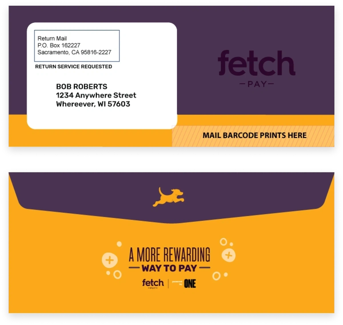
The envelopes shown above were designed by the Marketing team. For security and postal regulations on debit cards, we could not display explicit details, but we added a bold Fetch brand presence.
Results
Proven impact on conversions and activation costs.
Increase in sign-up conversions
The application completion rate grew steadily with the new onboarding experience.
Increase in card activations
Active card activations rose post-approval, driving transaction velocity.
Reduction in card delivery costs
Transitioning to standard branded envelopes eliminated high express courier fees.
Future Engagement
Exploring smartwatch wearable integration.
Since most debit cards do not offer theft protection, I proposed adding the card to their digital wallet for easy smartwatch access—a common and secure wearable payment method. This solution is currently in the backlog.

The mockup demonstrates three of the most commonly used wearables in the industry.


